Abstract Wall Art: How to Choose and Style It
Colors, sizes, frames and hanging heights for abstract wall art, with room-by-room ideas for a calm Nordic wall or a bold one.
Quick answer
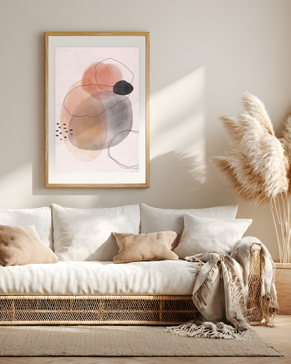
Abstract wall art is art that doesn’t try to look like a real object. It works through color, shape, line and texture instead. To choose it well, pick two or three colors already in your room, then decide on a look: geometric shapes for structure, organic shapes for softness, color field for calm, line art for lightness. For most walls, 50x70 cm (20x28 in) above a sofa or bed is the safe single-poster choice, and 30x40 cm (12x16 in) works well in pairs and gallery walls. A thin wood or black metal frame suits nearly every abstract print.
What is abstract wall art?
Abstract wall art is any print, poster or painting where the subject is the composition itself rather than a recognizable scene. No house, no face, no landscape: just the relationship between a shape, a color and the space around it.
That sounds vague until you see it on a wall. Then it becomes very practical: because there’s no story to read, your eye treats the piece more like a textile or a piece of furniture. It adds color and rhythm without demanding attention.
The main looks you’ll meet when shopping for abstract art prints:
- Geometric: circles, arcs, squares, grids and hard edges. Structured and graphic. Good for rooms with a lot of soft furniture that need a bit of discipline.
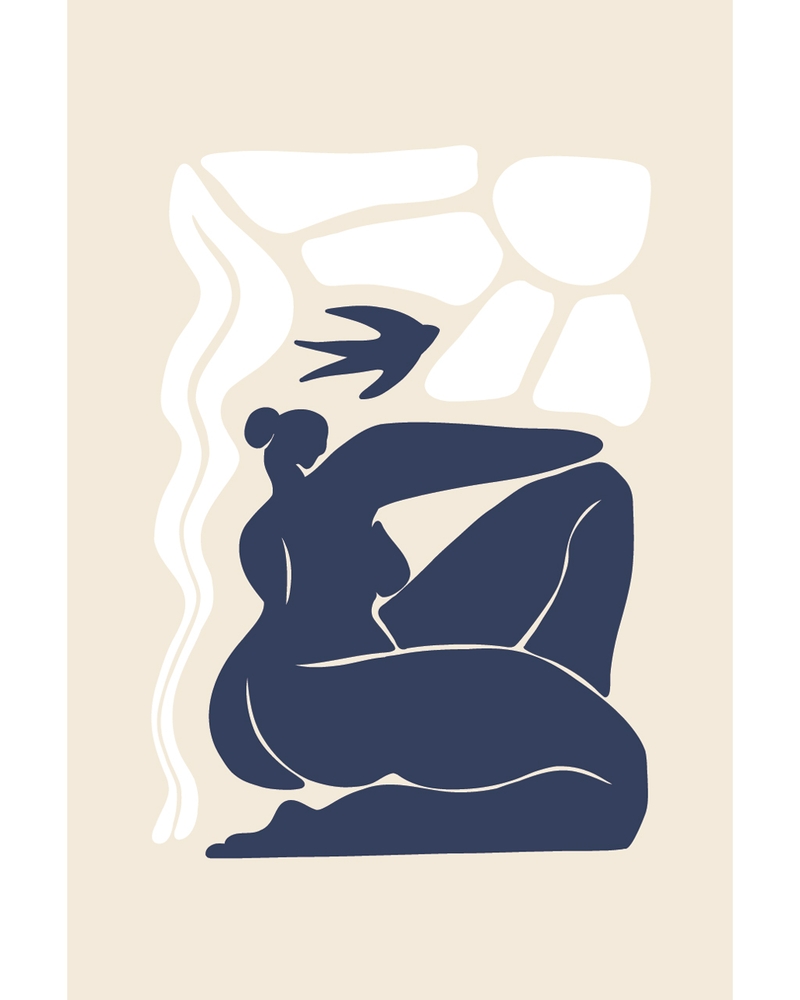
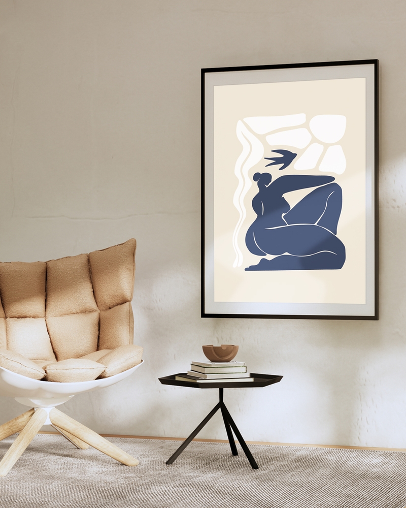
- Organic shapes: rounded, hand-drawn blobs and curves, often in two or three flat colors. Warmer and less formal than geometric work.
- Color field: large blocks or washes of color with almost no detail. Quietest of all. Reads as texture from across a room.
- Line art: single continuous lines, often suggesting a figure or a plant without ever naming it. Light, airy, easy to mix.
- Textured and painterly: visible brush marks, ink washes, scraped paint. Adds a handmade feel to a flat, modern room.
- Collage and cut-paper: layered shapes with torn or clean edges, usually in a limited palette.
Most abstract posters sit in more than one camp. A print can be geometric and color field; an organic shape can be painterly. The categories are there to help you talk about what you like, not to box anything in.
One thing worth saying plainly: abstract doesn’t mean loud. A pale sand-and-chalk composition is just as abstract as a hot pink arc on cobalt. The style is a language, not a volume setting.
Why does abstract wall art work so well at home?
Because it’s flexible. Abstract art prints adapt to a room instead of competing with it, which is why they survive repainting, new sofas and house moves.
It doesn’t date the way literal imagery does. A photograph of a city skyline ties your wall to a place and a year. A composition of two arcs and a soft gradient doesn’t.
It pulls a room’s colors together. This is the practical superpower. If your room has a green plant corner, a rust throw and oak floors, one abstract print carrying all three shades makes the whole thing look deliberate rather than accumulated.
It works at any scale. The same composition reads well small in a hallway cluster and large above a bed. Representational art often loses detail when shrunk; abstract work rarely does.
It’s easy to mix. Abstract sits comfortably beside photography, botanical prints and typography on the same wall, because it doesn’t argue about subject matter.
It suits rented walls. Nothing in an abstract print assumes a particular architecture. White box flat, old apartment with cornices, new build with low ceilings: it adapts to all of them.
There’s a design-history reason the look feels so at home in Scandinavian interiors. Early-twentieth-century abstraction and the Nordic design tradition share the same instincts: reduce to essentials, trust the material, leave space. You can see that lineage in collections at institutions like Nationalmuseum in Stockholm, which traces how Nordic design moved toward simplified form and honest materials. Abstract work on a plain wall is the same idea, hung up.
At NordicPosterStore we mix bold abstract and colorful pieces into an otherwise calm Nordic range, precisely because one confident abstract print is often what stops a minimal room from feeling unfinished.
What makes abstract wall art hard to choose?
Four things trip people up, and all four are fixable.
1. There’s no obvious “right” one. With a landscape print you either like the place or you don’t. With abstract work, the decision is about feeling, and feeling is hard to shop for. The fix is to stop judging the image on its own and start judging it against your actual wall color and sofa.
2. Scale goes wrong more often than color. A 30x40 cm (12x16 in) print floating alone above a three-seat sofa is the most common mistake in home decorating. Abstract art is especially sensitive to this, because a small abstract reads as a random smudge while a large one reads as intent.
3. Too many competing palettes. Three abstract posters, each strong, each in a different color world, cancel each other out. A gallery wall needs a shared thread.
4. Fear of bold. People default to beige abstracts because they feel safe, then find the wall disappears. If the rest of your room is neutral, the art is the only place color can come from.
How do you choose colors for abstract art prints?
Pick your palette from the room, not from the poster. Take a photo of the wall on your phone, look at which three colors repeat most, and choose abstract art prints that contain at least one of them.
For a calm Nordic room
Stay within one family and let the contrast come from tone rather than hue:
- Chalk white, oat, warm gray, soft black
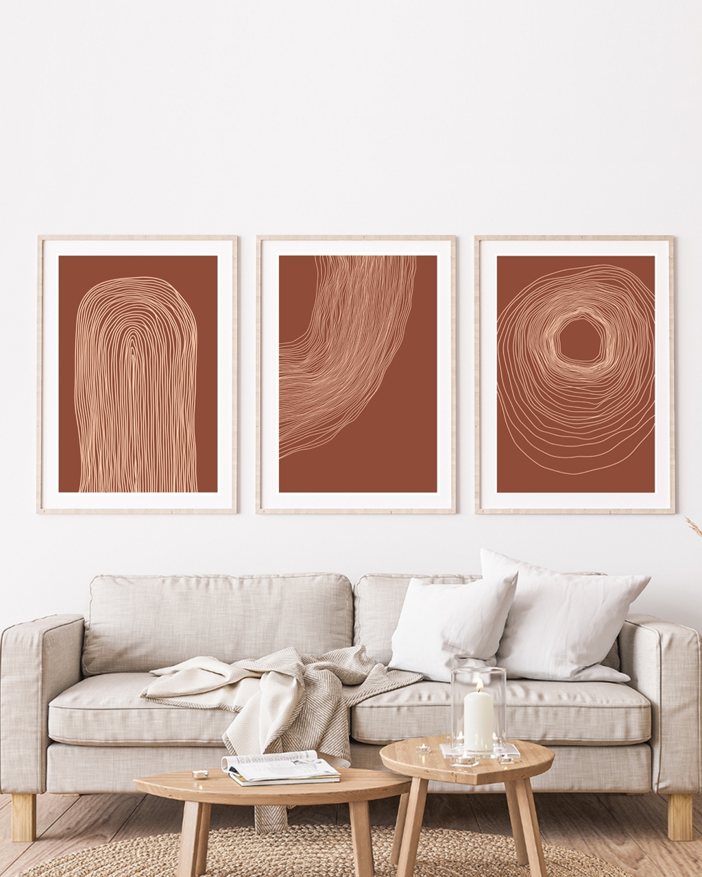
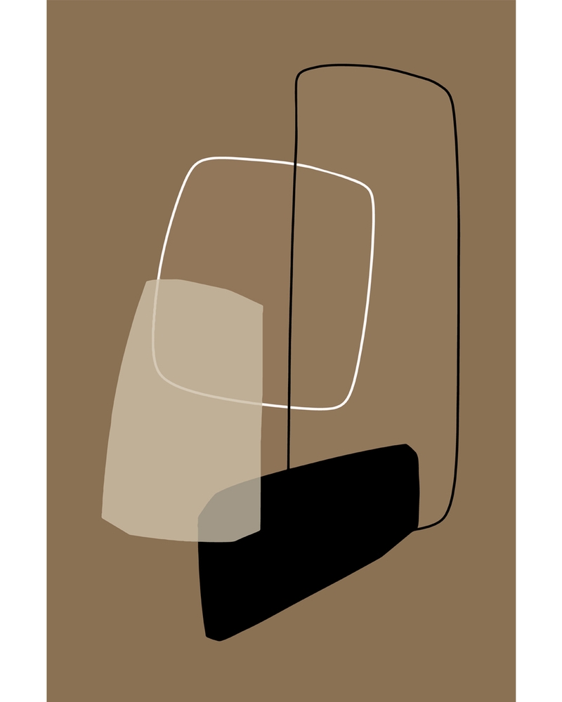
- Sand, clay, pale terracotta
- Sage, eucalyptus, muted olive
- Ink blue with off-white
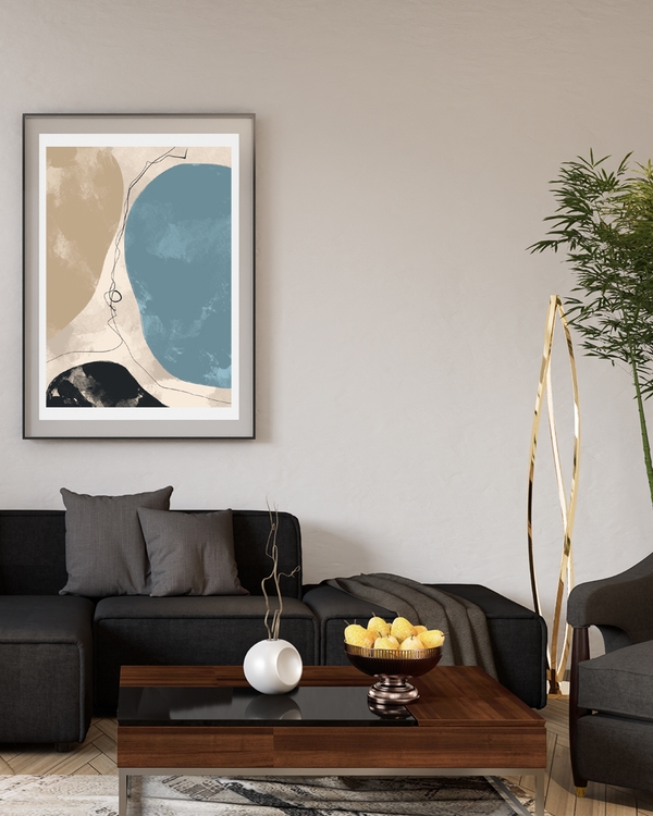
Keep the composition sparse: a single arc, two overlapping shapes, a lot of empty space. This is where Scandinavian posters and abstract work overlap most comfortably: the same restraint, applied differently. Hang one 50x70 cm (20x28 in) print above a dresser or beside the bed and leave the surrounding wall bare.
For a bold statement wall
Here you want saturation and contrast, and you only need one piece:
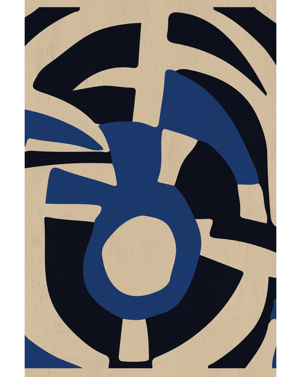
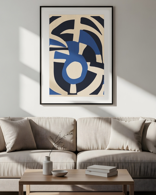
- Cobalt or ultramarine with mustard
- Deep rust and burnt orange on cream
- Emerald with rose
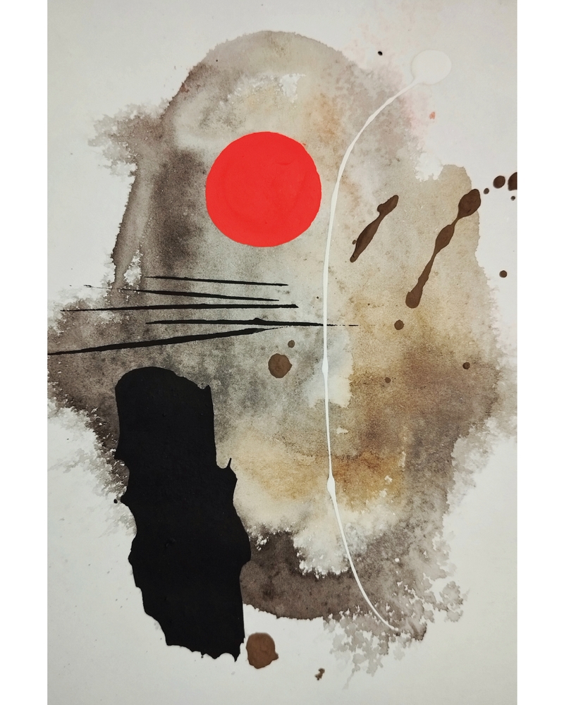
- Black, scarlet and raw paper
Go big: 70x100 cm (28x39 in) if the wall allows it, or a pair of 50x70 cm prints side by side. Then stop. One loud wall per room is plenty. The other walls can stay empty or hold something quiet.
The 60-30-10 shortcut
Borrowed from interior color planning and genuinely useful for art: roughly 60 percent of your room in a dominant neutral, 30 percent in a secondary tone, 10 percent in an accent. Your abstract print is the ideal place to put that 10 percent. It’s a small surface doing a lot of work, and it’s the easiest thing to swap if you tire of it.
Abstract posters in warm neutrals and bold color
Nordic Graphic Shapes
From CHF 19.00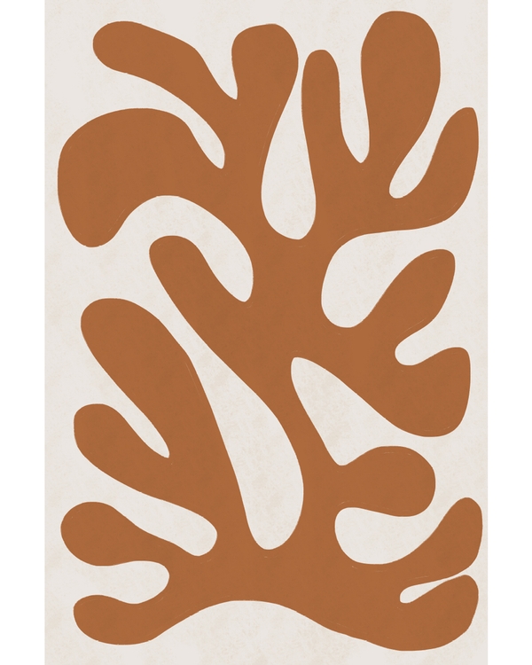
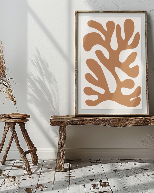
Abstract Shape Terracotta
From CHF 19.00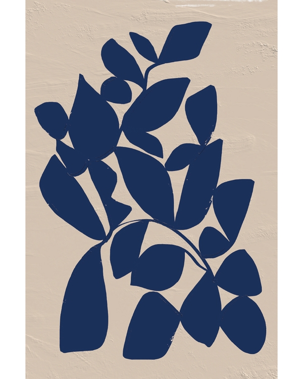
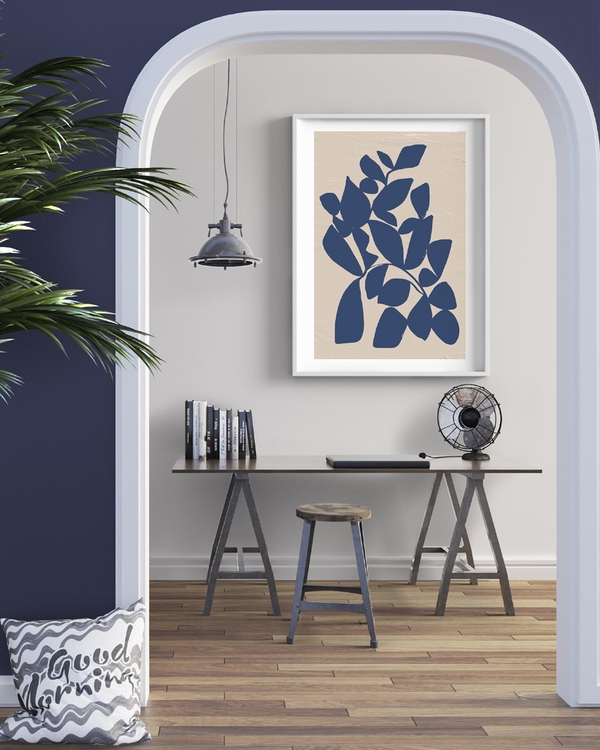
Navy Leaf Composition
From CHF 19.00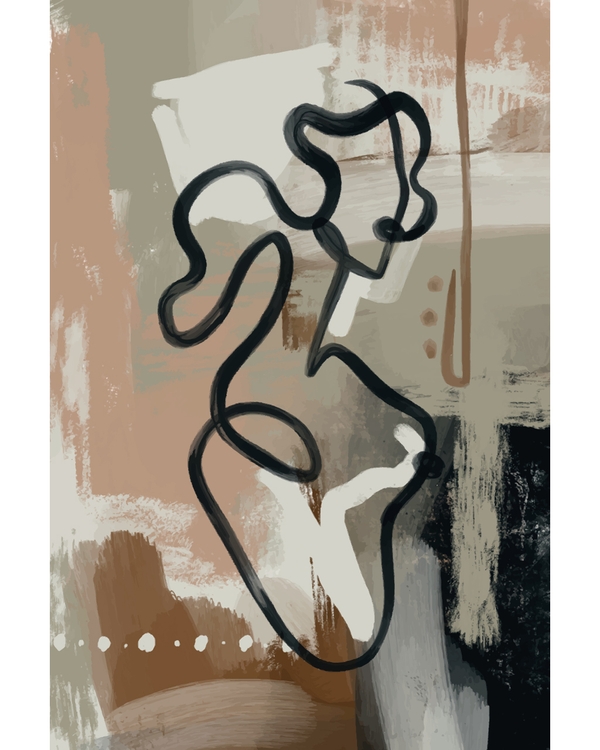
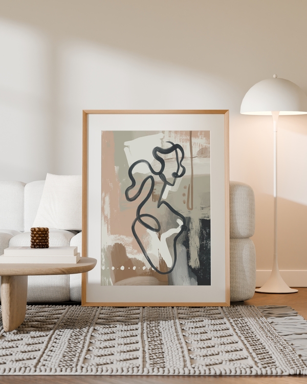
Modern Abstract Flow
From CHF 19.00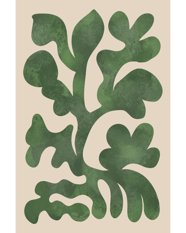
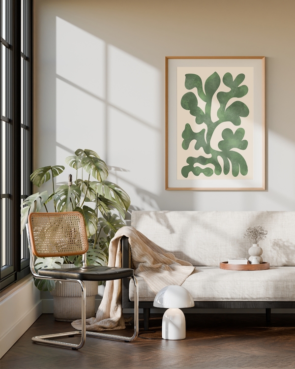
Nordic Green Forms
From CHF 19.00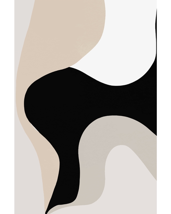
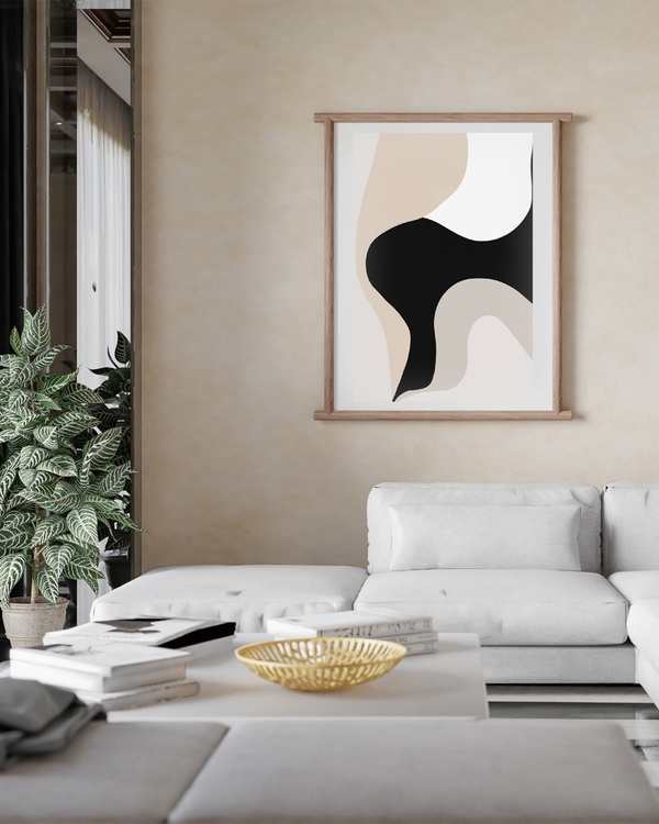
Ivory Flow
From CHF 19.00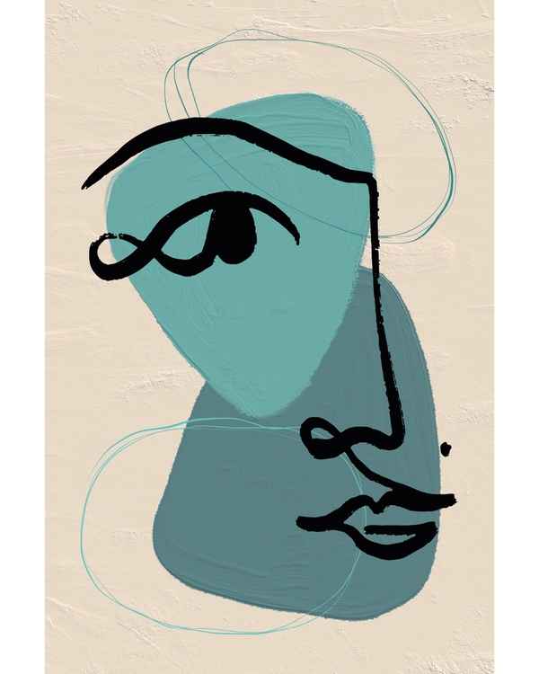
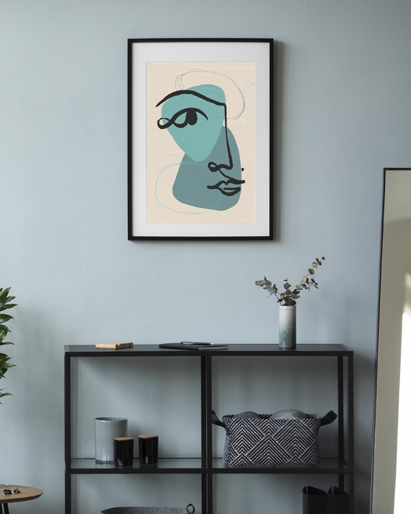
Nordic Abstract Portrait
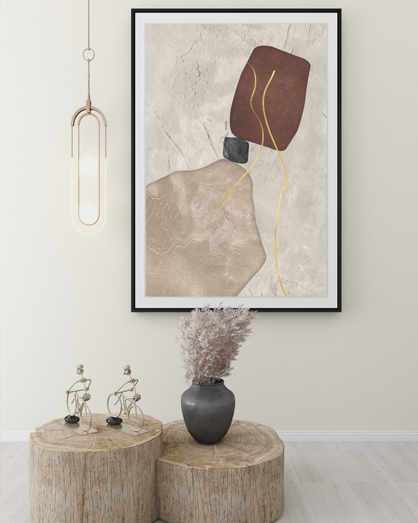
From CHF 19.00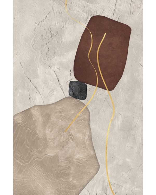
Quiet Composition
From CHF 19.00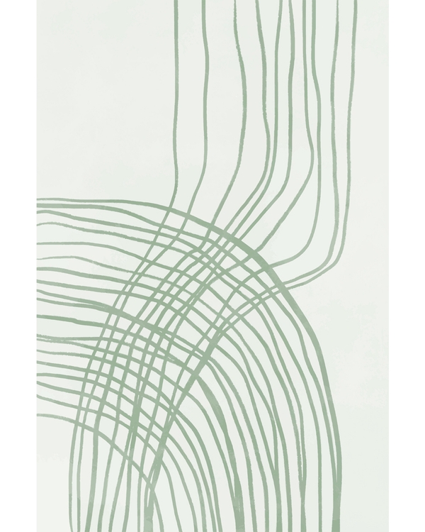
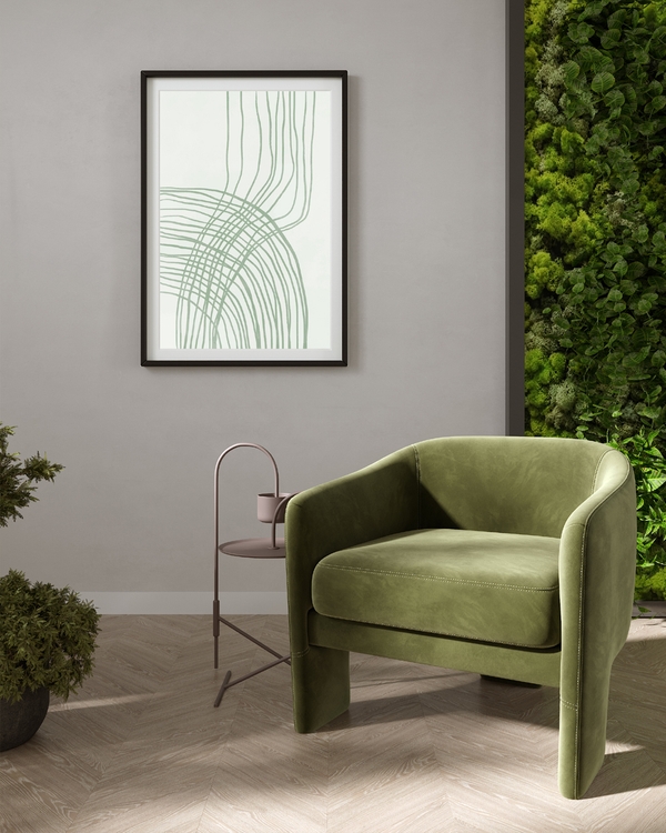
Nordic Weave
From CHF 19.00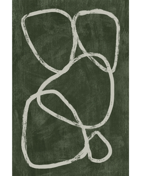
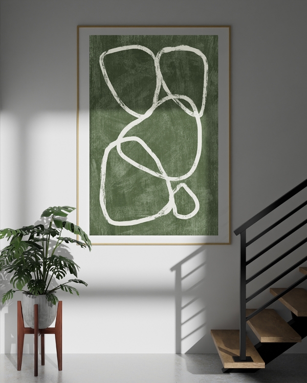
Deep Green Flow
From CHF 19.00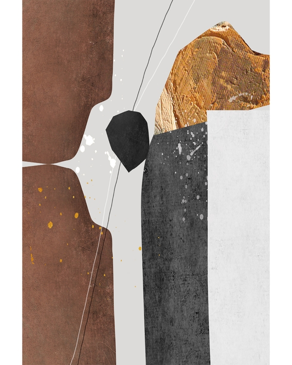
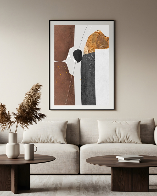
Nordic Earth
From CHF 19.00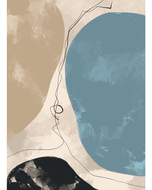
Earth & Sky
From CHF 19.00
What size abstract poster do you need for each wall?
Measure the furniture, not the wall. A print above a sofa, bed or sideboard should span roughly two-thirds of that furniture’s width, as a single piece, a pair, or a cluster that adds up.
The sizes our abstract posters come in, and where each one earns its place:
- 21x30 cm (8x12 in): about A4. Narrow wall gaps, shelf ledges, small frames in a dense gallery wall, beside a door frame.
- 30x40 cm (12x16 in): the gallery wall workhorse. Pairs and trios, above a bedside table, in a hallway run.
- 50x50 cm (20x20 in): square, and offered in some designs. Strong above a square side table, in a symmetrical pair, or anchoring a grid of four.
- 50x70 cm (20x28 in): the single most useful size. Works alone above a two-seat sofa, a bed, or a dining sideboard.
- 60x90 cm (24x35 in): a few designs also come in this size. Where one does, it suits a three-seat sofa wall or a tall empty stretch in a hallway.
- 70x100 cm (28x39 in): one piece, big wall, nothing else needed. High ceilings and open-plan rooms.
Not every design comes in every size, so check the size options on the product page before you commit to a layout.
Hanging height
Center the print at about 145–150 cm (57–59 in) from the floor, roughly eye level for most people standing. Above furniture, leave about 15–25 cm (6–10 in) between the top of the sofa back and the bottom of the frame. Any higher and the art floats away from the room.
Above a dining table or a bench where everyone is seated, you can drop the center a little lower, to around 140 cm.
Which frame suits abstract art?
Thin frames, almost always. Abstract compositions rely on breathing space, and a heavy ornate frame fights the artwork for attention.
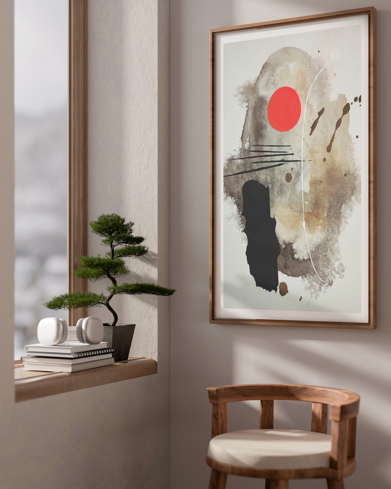
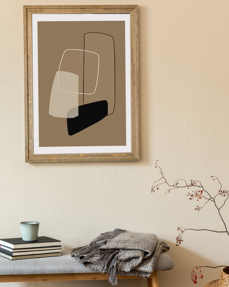
Light wood warms up cool palettes and softens hard geometry. It’s the default for a Nordic room and sits well with pale walls, linen and natural materials.
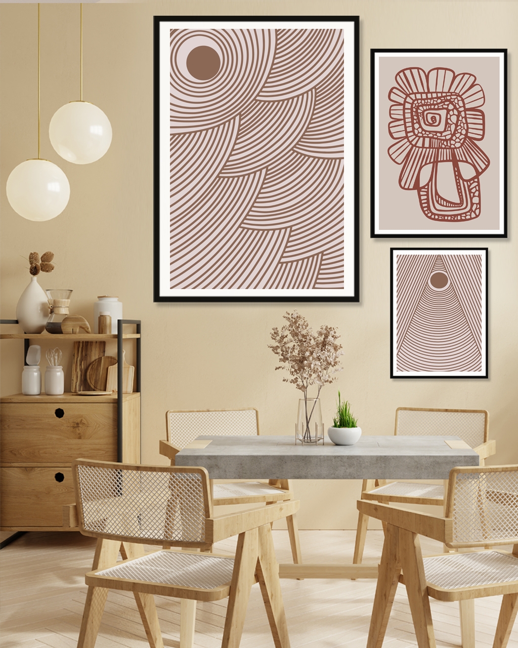
Black metal sharpens everything. Choose it for line art, high-contrast black-and-white abstracts, and anything graphic. It also unifies a gallery wall made of very different prints, because the frames become the shared element.
Dark wood suits warm earth palettes (rust, ochre, clay) and works beautifully in rooms with older wooden furniture.
No frame at all is a legitimate choice. A poster hung with wooden poster hangers or clipped to a rail looks relaxed and makes swapping prints easy. It suits rentals and kids’ rooms.
A note on borders: most of our designs have a white border printed around the artwork, which gives the airy effect people usually get from a passe-partout (a card border placed between the print and the front of the frame). We don’t sell passe-partouts, so if you like that look, choose a design with a generous printed border instead. Some designs print edge to edge, which looks bolder and fills the frame completely.
If you’re weighing up frame materials and finishes in more detail, our guide to choosing the right frame goes through it properly.
Frames across a set
Three approaches, in order of how forgiving they are:
- All identical: same material, same width. Hardest to get wrong, works for any mix of prints.
- Two frame types, alternating: wood and black, for example. Adds rhythm without chaos. Needs an even visual distribution.
- All different: only works if the prints share a very tight palette. Attempt this when you’re confident.
How do you mix abstract wall art into a gallery wall?
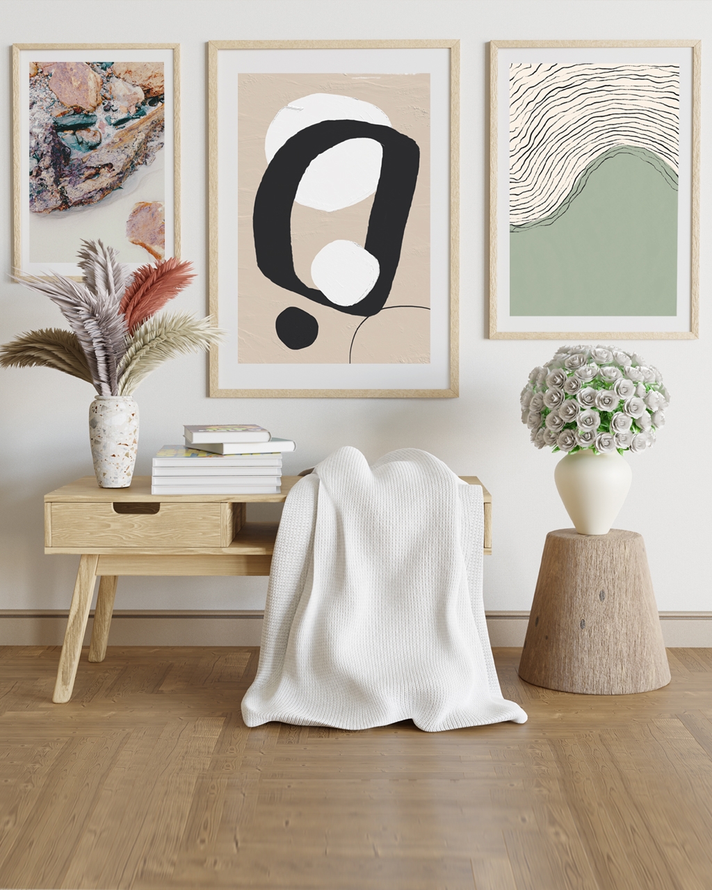
Give the group one shared thread and let everything else vary. The thread can be palette, frame, or style. Choose one, not all three at once.
Abstract with Scandinavian prints
The easiest pairing. Take two or three muted abstract shapes and one minimal Nordic landscape or architectural print. Keep everything within the oat-sand-gray-ink range, frame it all in light wood, and the wall will feel considered without feeling matched.
Abstract with botanical prints
Abstract shapes give botanical work somewhere to breathe. A leaf study, a pressed-flower print and a soft organic abstract in the same green-and-cream palette make a gentle, natural group. It suits bedrooms and hallways. Our guide to styling botanical prints covers that side in depth.
Abstract with black and white
The most graphic option. Black-and-white photography, a typographic print and a bold black abstract shape, all in black metal frames. Add exactly one colored abstract as the surprise element, and place it off-center.
Layout rules that hold up
- Keep a consistent gap between frames: 5–7 cm (2–3 in) for small prints, up to 10 cm (4 in) for large ones.
- Start with your largest piece slightly off-center and build outward.
- Lay the whole arrangement on the floor first, photograph it, then hang.
- Cut paper templates to frame size and tape them up before you make a single hole.
If you’d rather skip the planning, our ready-made abstract gallery wall sets are chosen to work together across sizes and palettes. And the full how to create a gallery wall guide walks through spacing and hanging step by step.
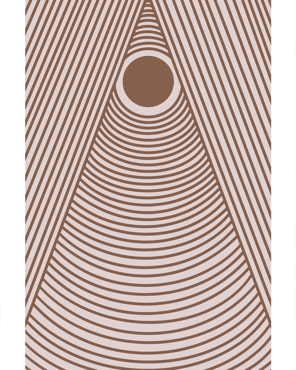
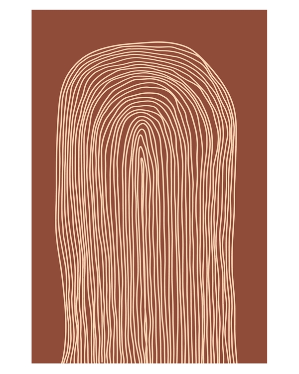
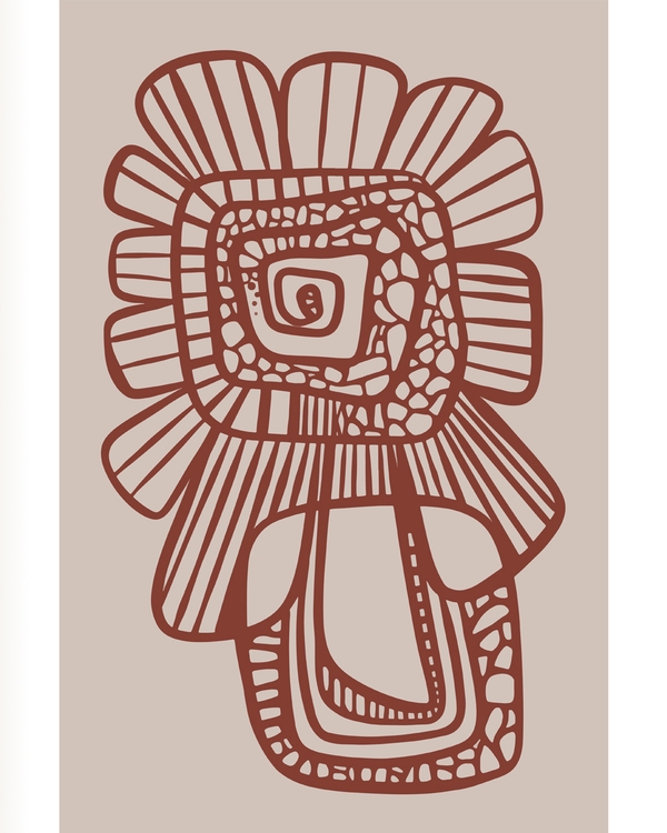
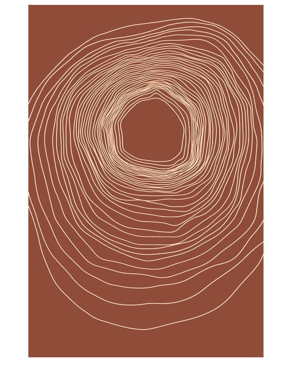
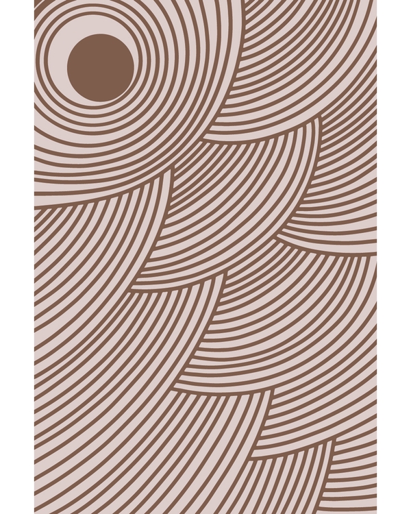
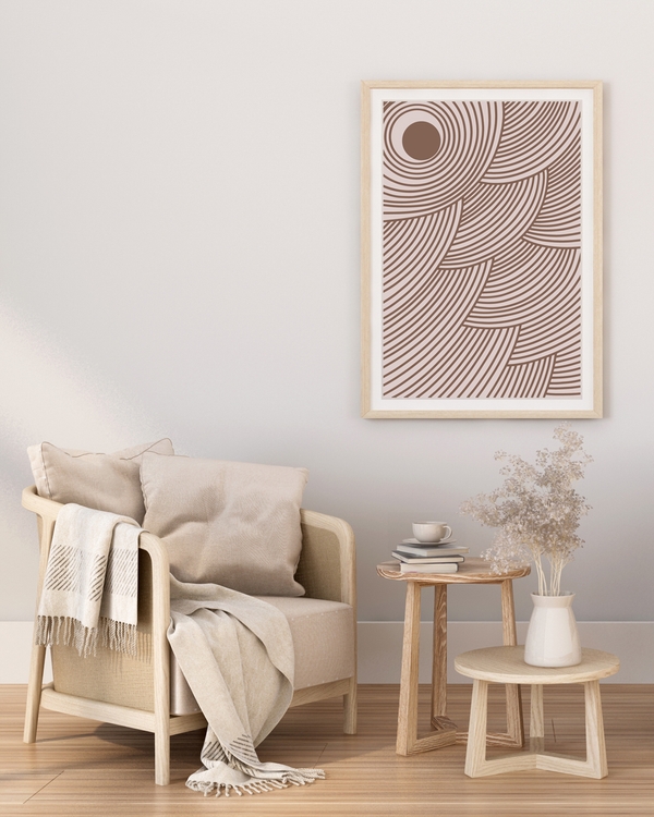
Abstract posters in warm brown and beige
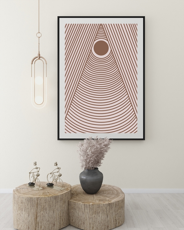
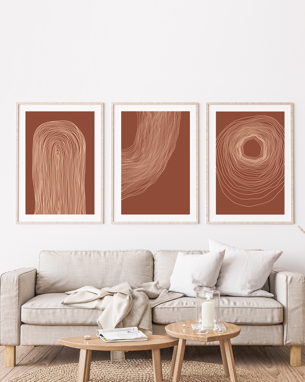
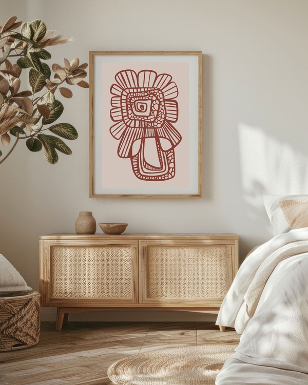
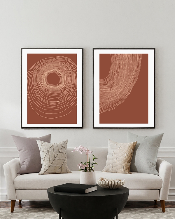
Where does abstract wall art go, room by room?
Living room
The main wall above the sofa is where a single large abstract does its best work. One 70x100 cm (28x39 in) piece (or 60x90 cm, which a few designs also come in) in a palette drawn from your textiles, hung low enough to feel connected to the furniture. If you prefer a group, three 30x40 cm prints in a horizontal row read as one wide shape. There’s more on arrangement in our living room poster inspiration.
Bedroom
Quiet is the goal. Soft organic shapes, color field washes, pale line art. A symmetrical pair above the bed, or one wide piece centered on the headboard. Avoid high-contrast black on white directly above where you sleep. It’s visually noisy at the exact moment you want calm.
Hallway
The hallway you walk through every morning is the best place for bold abstract work, because you only see it in passing. A vertical run of three prints along the wall, or one strong piece at the end of a corridor to draw the eye through.
Kitchen and dining
Keep it simple and wipeable: framed behind plexiglass, away from the hob. Geometric abstracts in warm tones sit well with wood and ceramics. Our kitchen wall art guide covers placement around cabinets and splashbacks.
Home office
Line art and geometric grids. Something with structure that doesn’t pull focus during a call, positioned on the wall behind you or to the side of your screen.
Kids’ room
Bold organic shapes in primary or candy colors, hung lower than adult eye level, around 110–120 cm (43–47 in) to center. Unframed or in light wood, for safety and for easy swapping as taste changes.
Best practices for styling abstract wall art
Ten things worth doing, drawn from the mistakes people make most often.
- Shop the room first. Photograph your wall, note the three dominant colors, then browse. Browsing cold leads to prints you love in isolation and can’t place.
- Buy one hero, not five maybes. A single well-chosen large abstract beats a scattering of small uncertain ones.
- Let the art be the color. In a neutral room, the print is where saturation belongs. Don’t match the beige.
- Repeat a color three times. If your abstract has mustard in it, put mustard somewhere else twice: a cushion, a book spine, a ceramic.
- Respect negative space. Leave wall empty around the piece. Abstract work needs room to be read.
- Use the two-thirds rule. Art width should be about two-thirds of the furniture below it.
- Hang lower than instinct says. Most people hang 10–15 cm too high. Measure to 145–150 cm at center.
- Unify a mixed set with frames. When prints differ, identical frames do the work of making them a group.
- Odd numbers in a row. Three or five prints in a line look intentional; four can read as a grid gone wrong.
- Rotate seasonally. Posters are easy to swap. Warmer palettes for winter, lighter ones for spring. Our spring gallery wall refresh guide has specific swaps.
Quick do’s and don’ts
- Do test the composition on the floor before hanging.
- Do consider the view from your usual seat as well as from the doorway.
- Don’t hang two strong abstracts on facing walls. They compete.
- Don’t put a highly textured abstract behind a busy patterned sofa.
- Don’t center art on the wall when the furniture is off-center; follow the furniture.
Common mistakes
- Going too small. The single biggest error. When in doubt, size up one step.
- Hanging too high. Art belongs in relation to furniture and eye level, not ceiling height.
- Mixing five palettes on one wall. Pick a thread (palette, frame or style) and hold it.
- Choosing safe beige everywhere. If nothing in the room has color, the art needs to.
- Thick, ornate frames. They crowd abstract compositions. Thin profiles let the work breathe.
- Ignoring light. Direct sunlight on any paper print will fade it over time. Hang away from south-facing glare where you can.
What to look for when buying abstract art prints
Four things actually matter, and price isn’t the first of them.
Paper. A heavy matte stock holds color better and doesn’t reflect lamplight back at you. Glossy paper looks sharp in a photo and shows every fingerprint and glare line in a real room. Our posters are printed on 200 gsm matte paper that’s FSC-certified, meaning the pulp comes from responsibly managed forests. The paper carries the certification, not the company.
Size range. A design that only comes in one size limits your layout. Across our 1000+ designs there are several sizes, from 21x30 cm up to 70x100 cm, though not every design is available in all of them.
Whether the designs work together. If you think you might build a gallery wall later, buy from a range where the prints share a visual language. That’s the thinking behind our abstract poster collection: pieces chosen in Gothenburg with a Nordic design eye, so a bold geometric and a quiet color field can still sit on the same wall.
Framing options. Buying frames with the posters saves measuring and guesswork. We offer wooden and black metal frames as an add-on. Wooden frames can arrive ready to hang, with the poster already mounted, or unassembled if you prefer.
Each poster is printed on demand after purchase on 200 gsm matte FSC-certified paper and shipped by our print partners. For delivery questions, see our FAQ page.
When a poster isn’t the right answer
Worth saying honestly: paper posters aren’t right for every situation. If you want deep physical texture (visible impasto, canvas weave, real brush relief), a paper print won’t give you that, and an original painting or a canvas piece will. We don’t sell canvas, metal or acrylic prints, so that’s a different shop’s job. Posters are the right answer when you want flexibility, a coordinated set, and the freedom to change your mind in a year.
How do you know it’s working?
Judge the wall after a week, not after an hour. Fresh art always looks slightly wrong for the first few days because your eye is used to the empty space.
Signs it’s landed:
- You notice the room, not the poster. The art has merged into the space rather than sitting on top of it.
- The colors repeat. You can point to at least two other things in the room carrying a shade from the print.
- Photos look better. Photograph the room on your phone. A camera flattens everything, which exposes bad scale and bad spacing fast.
- It reads from the doorway. Stand where you normally enter. If the art reads as one clear shape from there, the scale is right.
- You stop adjusting it. If you’re still nudging the frame after a week, the issue is usually height or size, not the artwork.
If something’s off, change one variable at a time: lower it, swap the frame, or move it to a narrower wall before you give up on the print itself.
Ready to find your abstract print?
Abstract wall art is the easiest kind of art to live with, because it works with your room instead of making demands of it. Pick your palette from what you already own, go one size bigger than feels comfortable, and keep the frame thin.
Or get gallery wall inspiration if you’d rather start from a set that’s already been put together.
Frequently asked questions
What is abstract wall art?
Abstract wall art is art that doesn’t depict recognizable objects, people or places. It communicates through color, shape, line and texture instead. The main styles are geometric, organic shapes, color field, line art and painterly or textured work. Because there’s no subject to interpret, abstract pieces tend to blend into a room’s overall look rather than dominating it.
What size abstract poster should I hang above a sofa?
Aim for art that spans about two-thirds of the sofa’s width. For a two-seat sofa, one 50x70 cm (20x28 in) print usually works. For a three-seat sofa, go to 70x100 cm (28x39 in) or use two or three smaller prints side by side. A few designs also come in 60x90 cm (24x35 in). Leave roughly 15–25 cm between the top of the sofa back and the bottom of the frame.
Can you mix abstract art with photography and botanical prints?
Yes, and it usually looks better than an all-abstract wall. The trick is one shared thread: either keep every print inside the same palette, or frame them all identically. Abstract shapes act as visual rest between more detailed images, which is why they work so well alongside botanical prints and black-and-white photography on a gallery wall.
What frame color goes with abstract art?
Light wood for warm, muted and Nordic palettes; black metal for graphic, high-contrast or line-art pieces; dark wood for rust, ochre and earth tones. Keep the frame profile thin in all three cases. If you’re hanging several different abstract prints together, using one identical frame throughout is the most reliable way to make them look like a set.
Is abstract wall art going out of style?
No. Abstract composition has been part of interior decorating for roughly a century and it adapts rather than dates, because it isn’t tied to a place, a person or a moment. What shifts is the palette: warm earth tones one year, cooler minimal grays another. Since posters are inexpensive to swap compared with furniture, it’s easy to follow those shifts without replacing anything structural.
How many abstract prints should one room have?
Usually one strong piece per wall, and one bold wall per room. A living room might hold a large abstract above the sofa and a small quiet print near a doorway, and that’s enough. If you want more, build a single gallery wall rather than spreading prints around every surface. Grouped art reads as deliberate; scattered art reads as leftover.
Related Posters
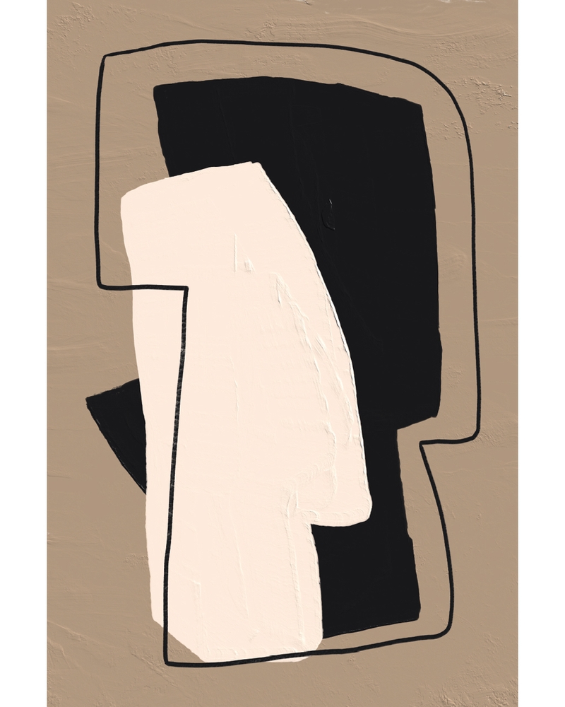
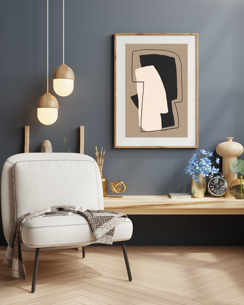
Related Stories
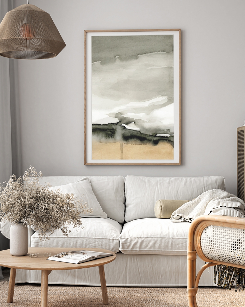
Poster Frames: Size, Wood or Metal Guide
How to choose poster frames: match the size to your print, pick wood or black metal for your room, and hang it at a height that feels right.
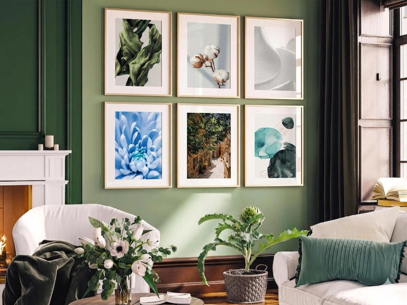
Botanical Prints & Floral Wall Art: How to Style Them in Every Room
There's a reason botanical prints never go out of style. Here's how to style them well in every room.
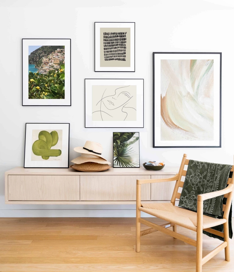
How to Create a Gallery Wall
There's something magical about a well-curated gallery wall. It transforms an empty space into a personal gallery, telling your story through carefully chosen art and photographs. Whether you're working with a spacious living room or a cozy hallway, creating a gallery wall is one of the most rewarding ways to make your home truly yours.
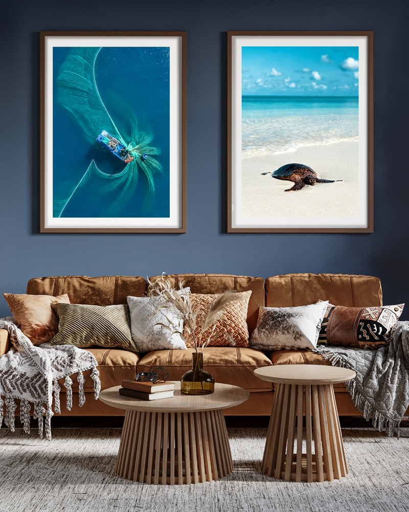
Posters for the living room — style tips & gallery ideas
Make your living room sing with posters: simple tips for size, placement and gallery walls that feel lived-in — not staged.