Abstract posters — Styling tips & inspiration
Abstract posters bring calm, character and flexibility to your home. Discover how to style them with color, size and placement for a balanced look.
By Mansour

Why choose abstract posters?
Abstract art plays well with Scandinavian design: subtle palettes, clean lines and tactile materials. It’s an easy way to elevate a space without over-cluttering.
“If you’re unsure where to start, choose one abstract poster you genuinely enjoy — not one that ‘matches everything’. It will anchor the room better than a safe choice.”
- Styling tips
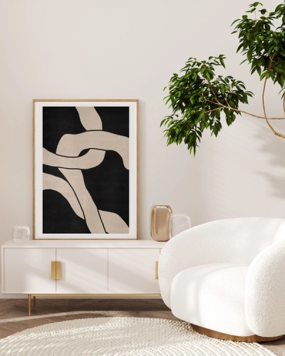
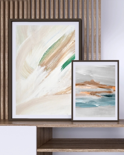
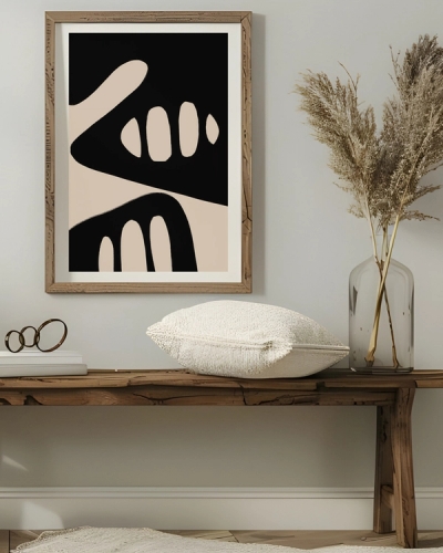
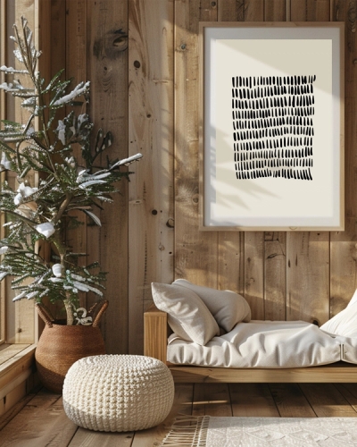
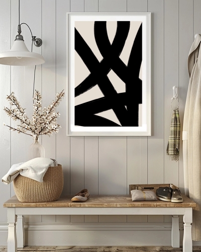
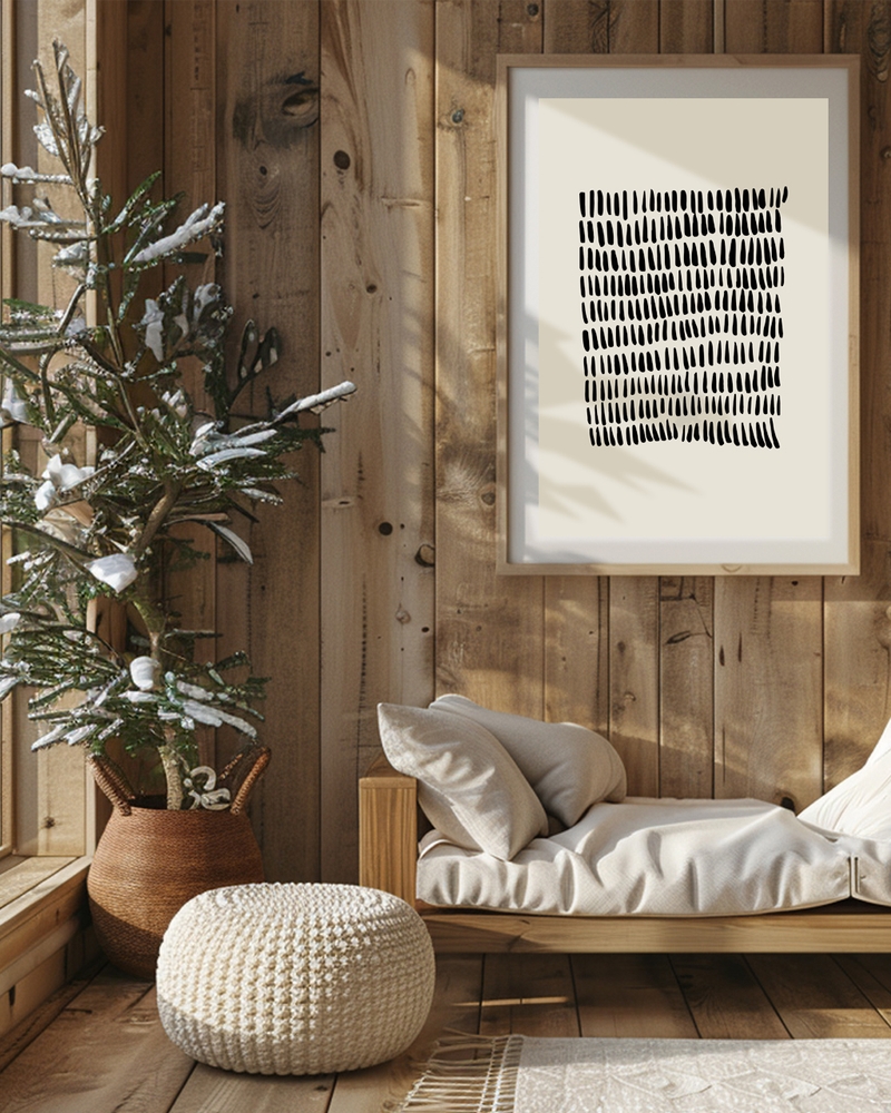
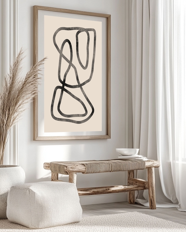
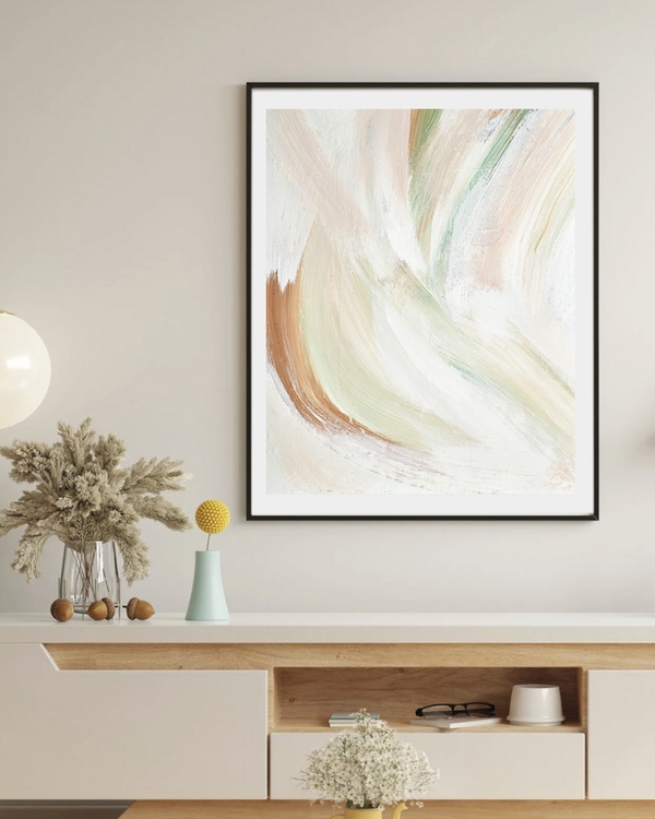
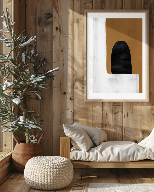
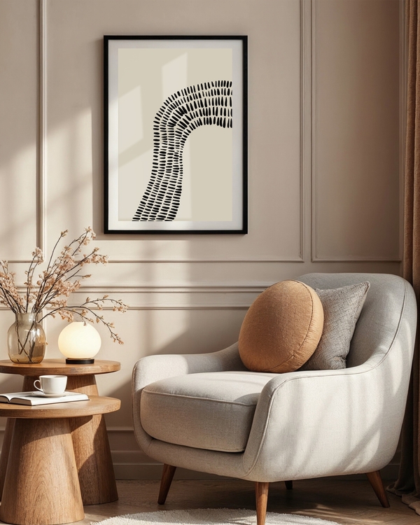
- Single large piece above a sofa for a calm focal point.
- Triptych or grouped prints for more visual energy.
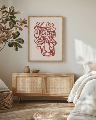
- Tie to textiles — pick a color from your rug or throw.
- Create contrast on pale walls with deep, saturated prints.
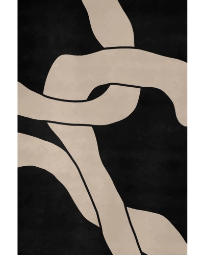
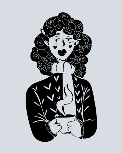
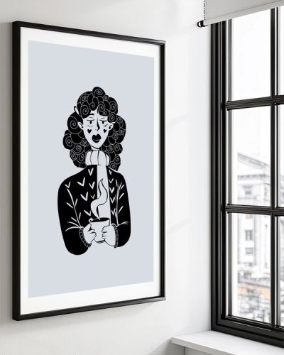
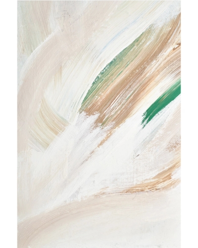
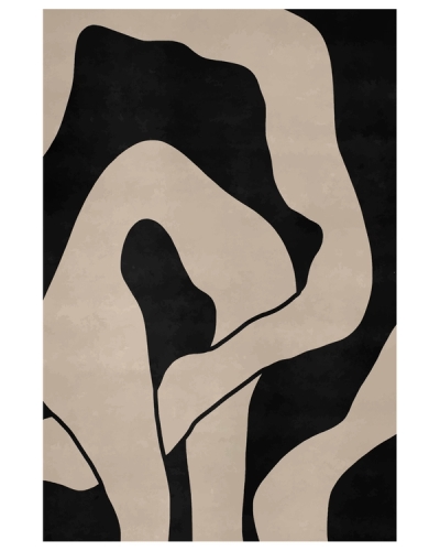
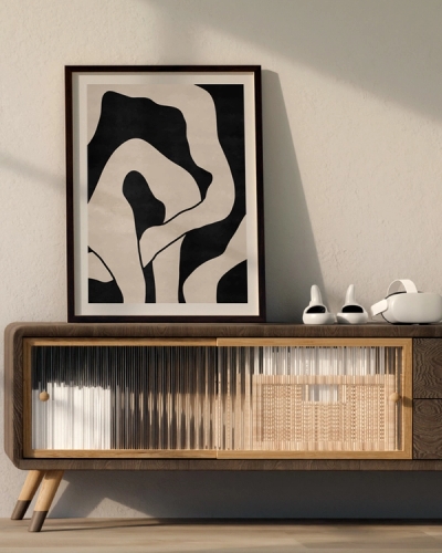
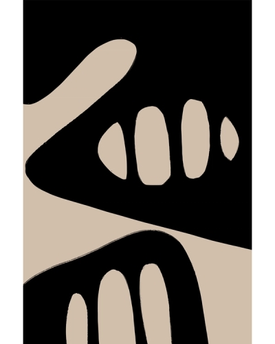
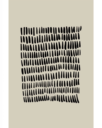
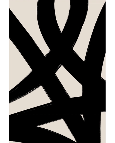
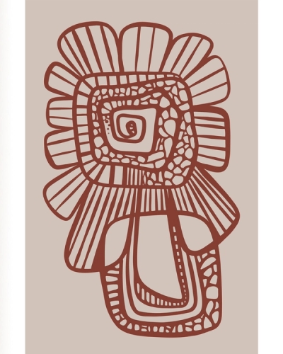
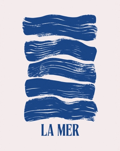
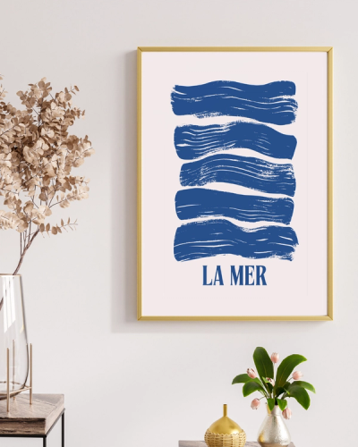
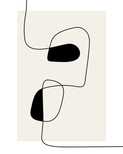
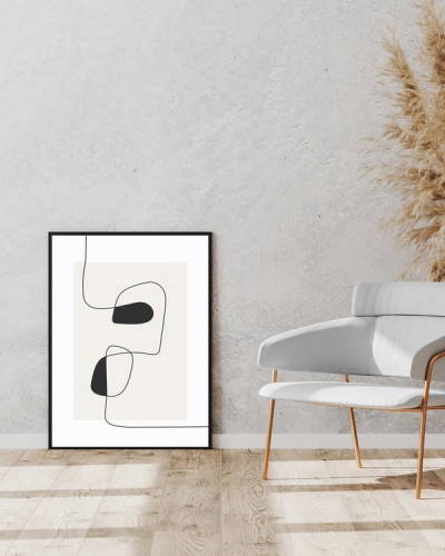
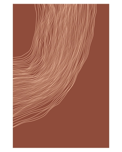
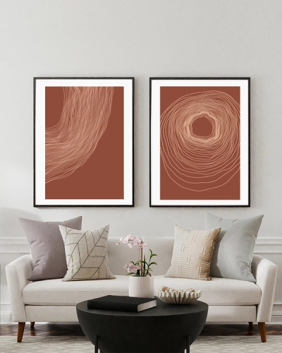
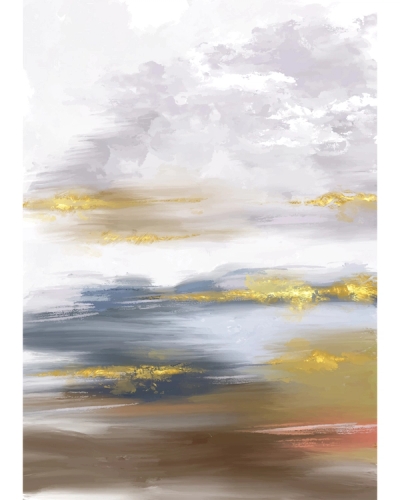
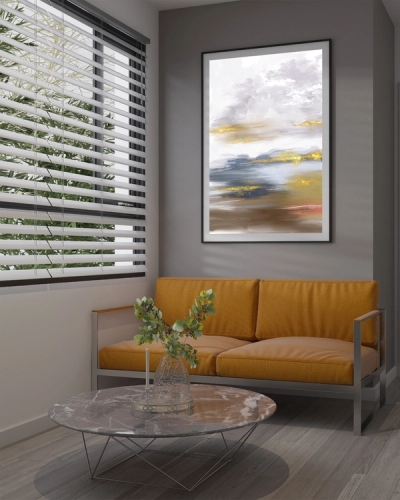
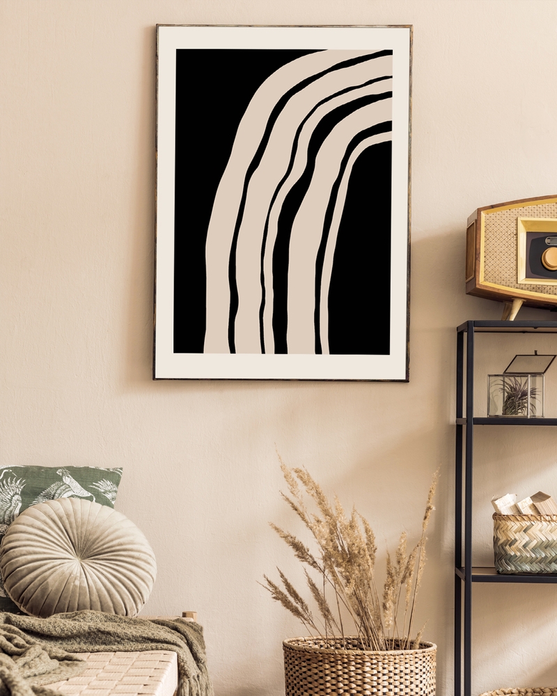
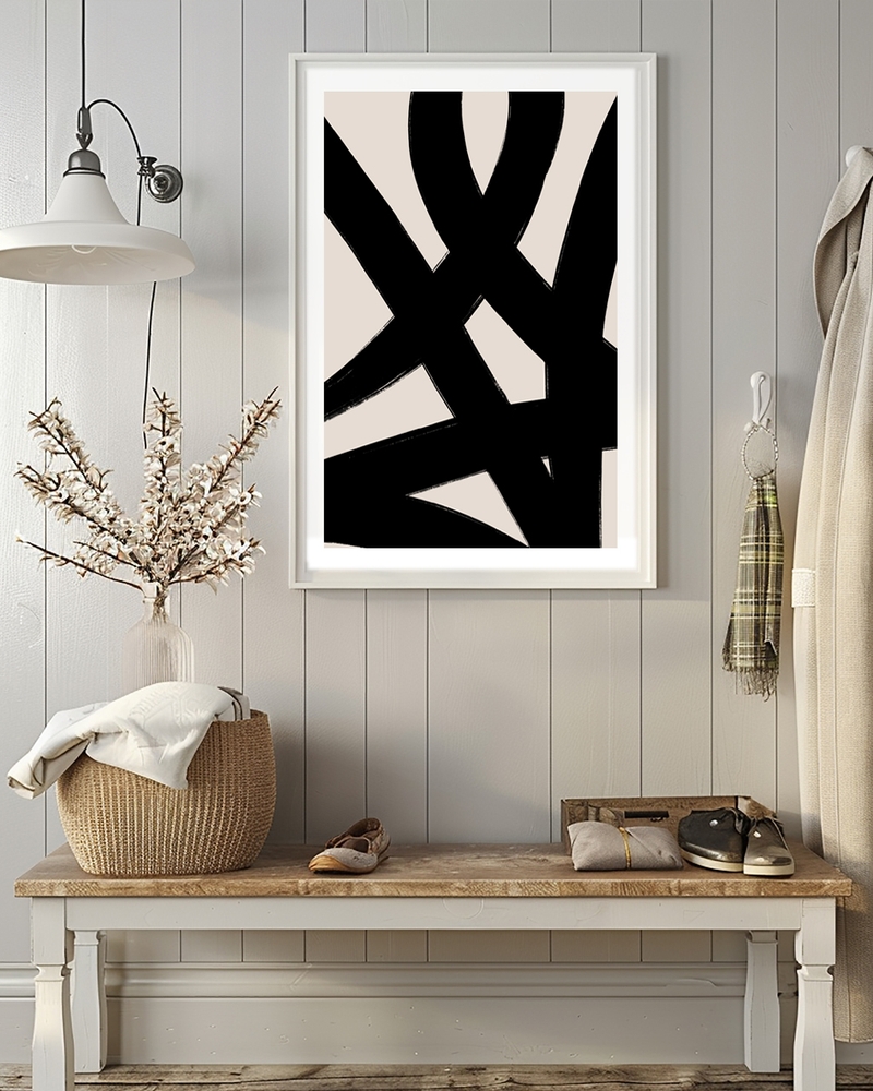
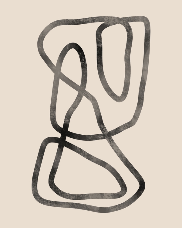
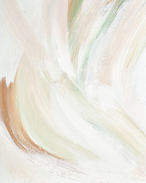
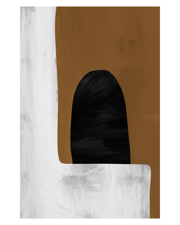
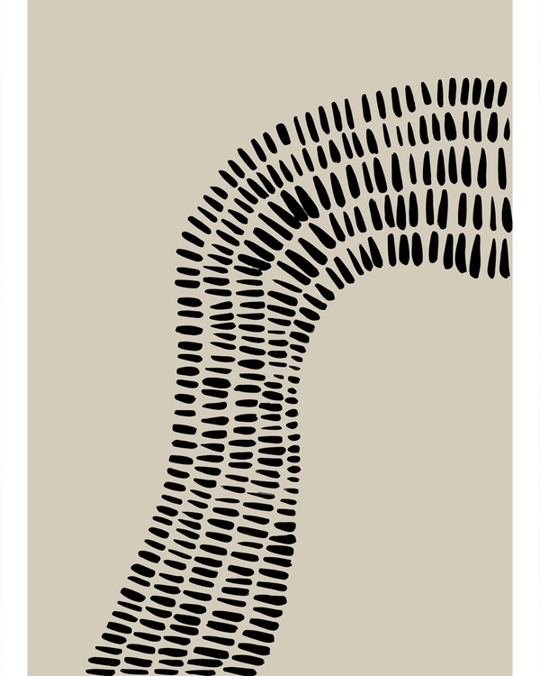
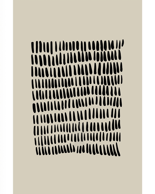
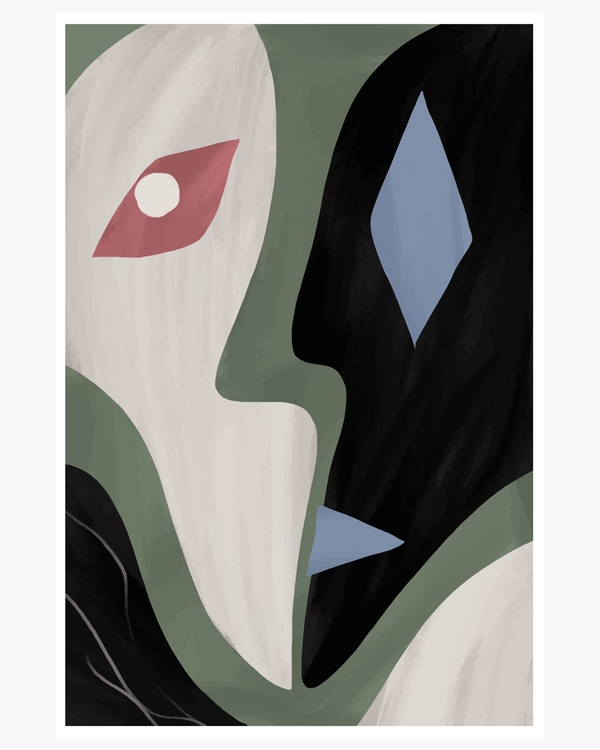
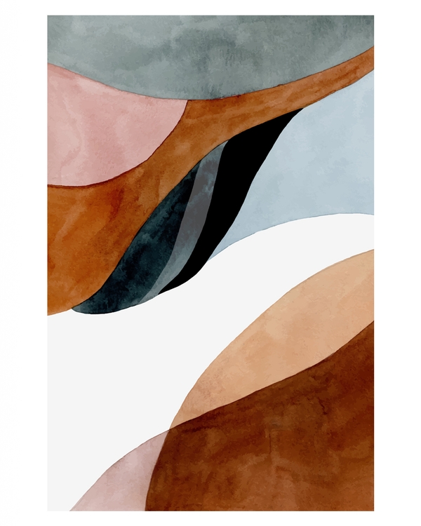
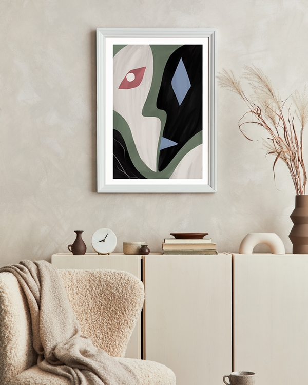
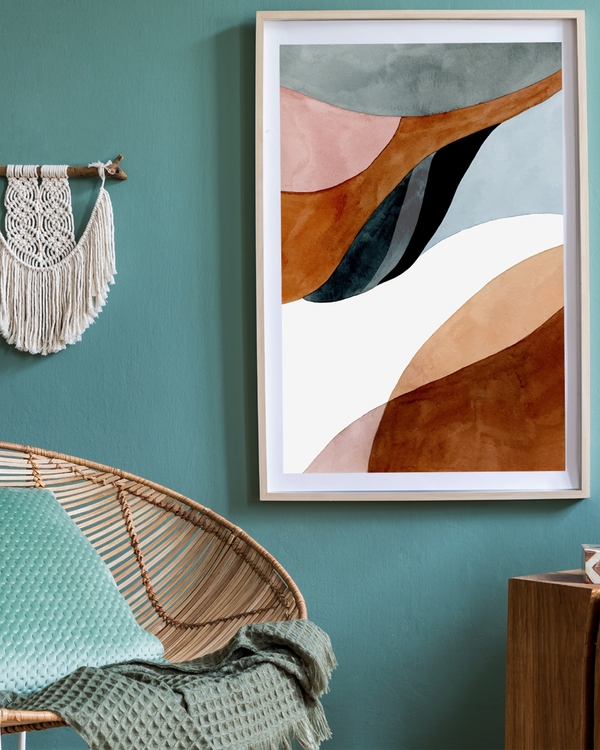
Here's a couple of handpicked abstract posters:

Size & placement guidelines
- Above sofa: aim for 60–70% of sofa width
- Narrow walls: vertical formats work best
- Gallery walls: keep a shared color palette, vary shapes
Give it breathing room
Abstract posters benefit from space. Avoid crowding them with shelves or other artwork. A bit of negative space makes the piece feel intentional.
Find more guides and styling ideas in our Stories hub.
Abstract posters don’t need explaining. When one feels right, it usually is — and that’s often the best starting point. Browse our gallery-ready sets and ready-made wall groups.