Botanical Prints & Floral Wall Art: How to Style Them in Every Room
There's a reason botanical prints never go out of style. Here's how to style them well in every room.
There's a reason botanical prints never go out of style. They bring life, colour, and a sense of calm to any room — without the maintenance of actual plants. Whether you're drawn to delicate wildflower illustrations or bold tropical leaves, floral wall art works in practically every space and with almost every interior style.
But hanging a botanical poster and making it look intentional are two different things. Here's how to style them well.
What Makes Botanical Prints So Versatile
Unlike many poster categories, botanical prints bridge the gap between decorative and timeless. A well-chosen leaf print or floral illustration doesn't feel trendy — it feels like it belongs.
Part of the appeal is range. Botanical wall art can go minimal (a single stem on a white background), warm and vintage (sepia-toned herbarium studies), or bold and contemporary (oversized tropical foliage). That flexibility means you can find something that fits whether your style is Scandinavian, bohemian, or somewhere in between.
They also play well with others. Botanical prints mix naturally with abstract art, photography, and text-based posters without clashing. That makes them ideal building blocks for gallery walls.
Choosing the Right Style of Botanical Print
Not all botanical prints are created equal. The style you choose should reflect both your room and your personality.
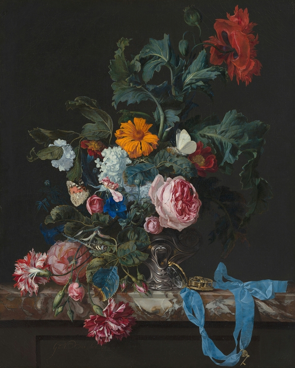
Classic botanical illustrations. Think scientific-style drawings with fine detail — the kind you'd find in a 19th-century herbarium. These work beautifully in traditional and Scandinavian interiors, especially in natural wood frames.
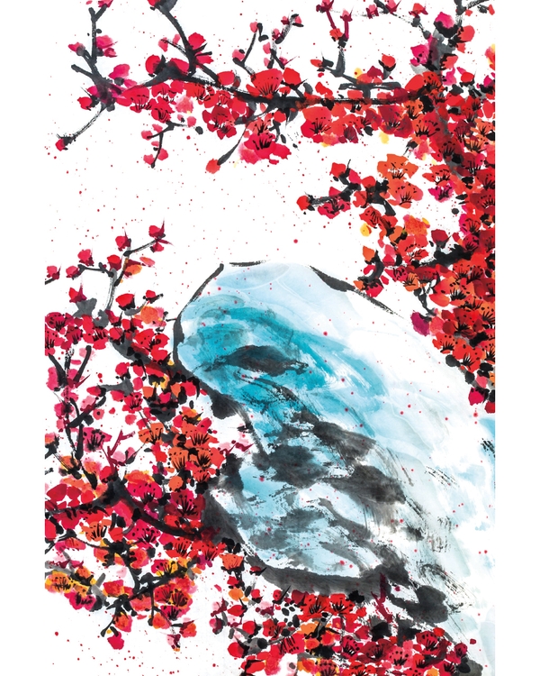
Modern minimal botanicals. Simple line drawings or single-colour plant silhouettes on clean backgrounds. Perfect for contemporary spaces where you want nature without visual noise.
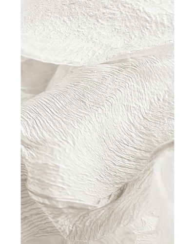
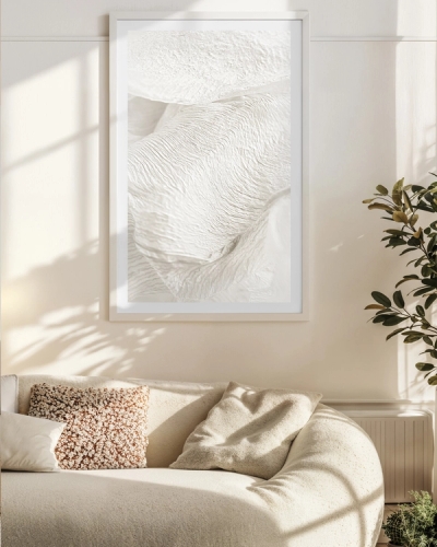
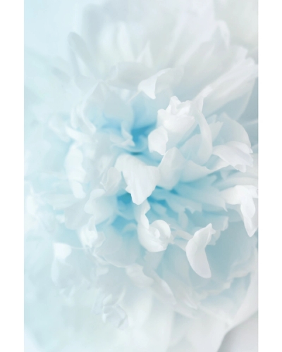
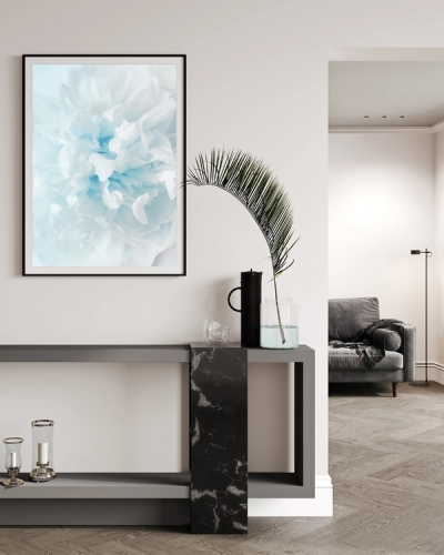
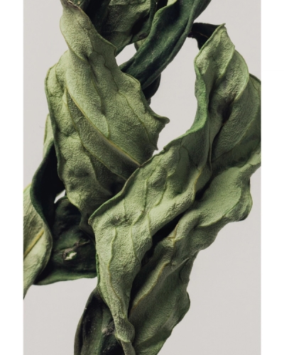
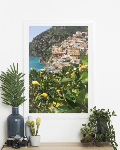
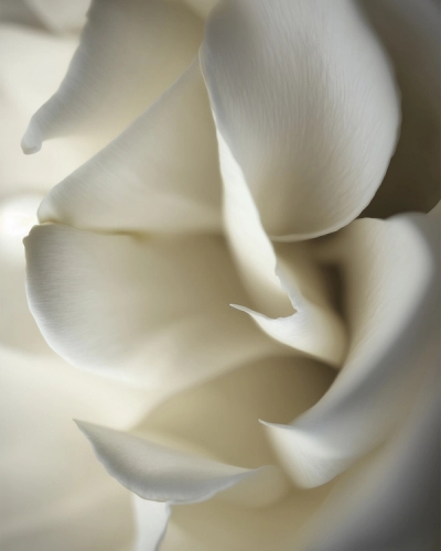
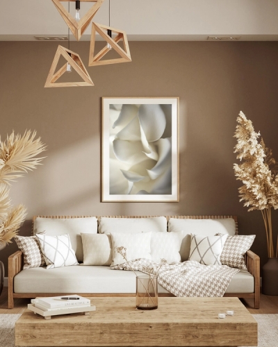
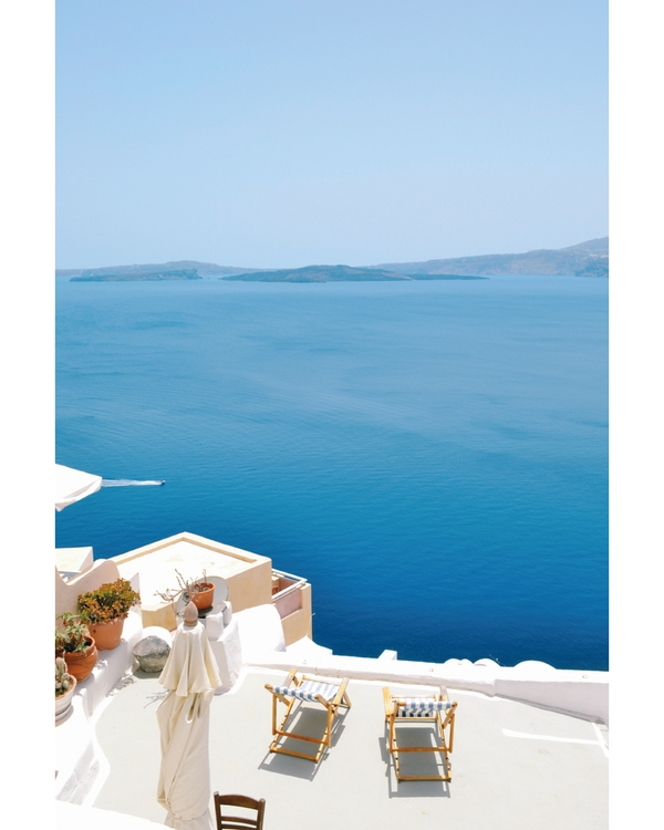
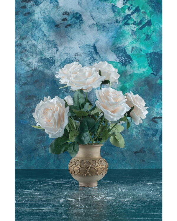
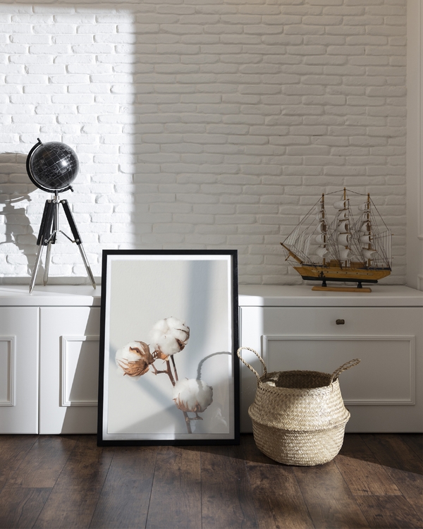
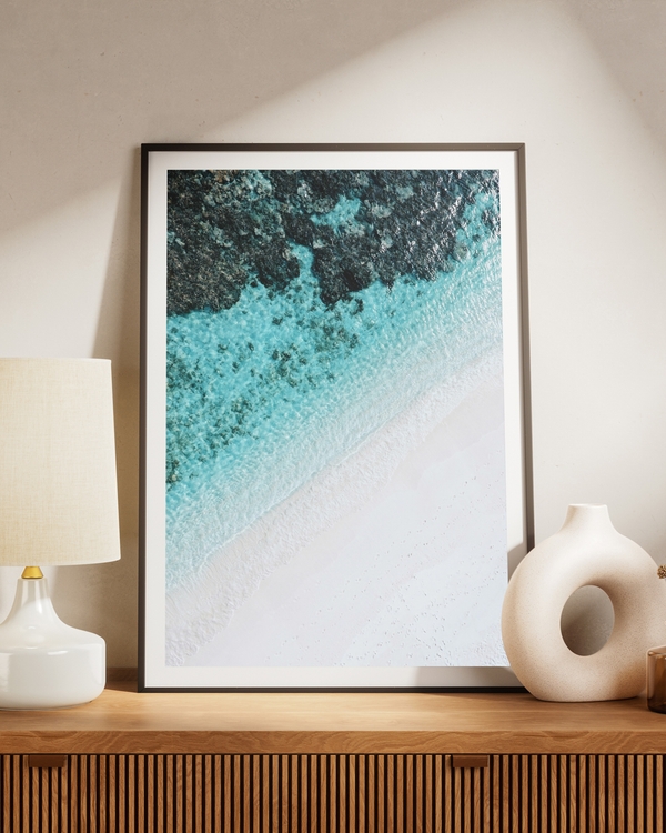
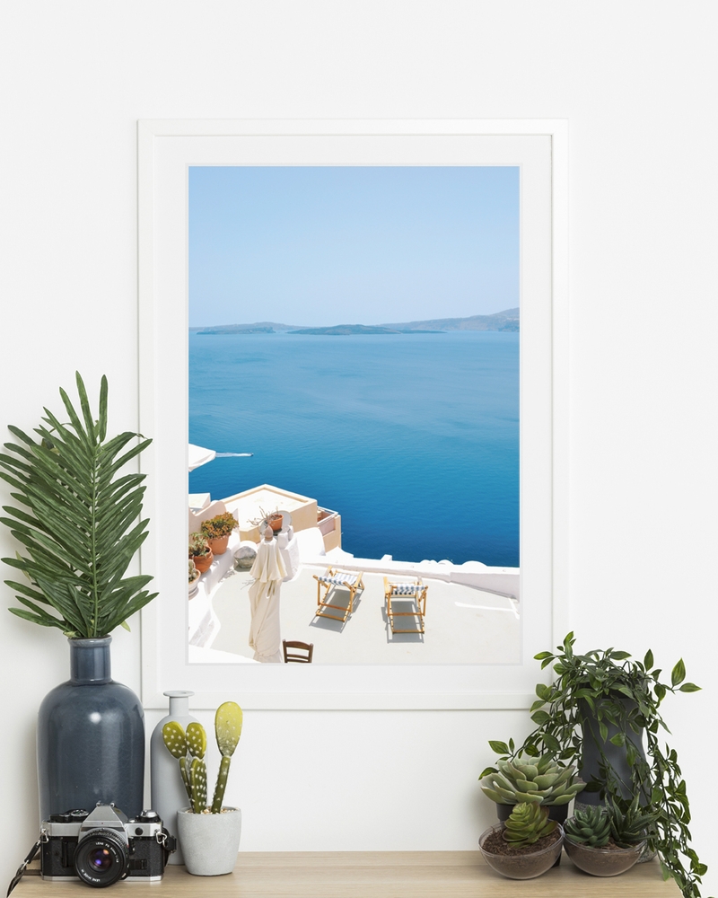
Photographic florals. Close-up photographs of flowers, petals, or foliage. These bring texture and depth and work well as statement pieces at larger sizes.
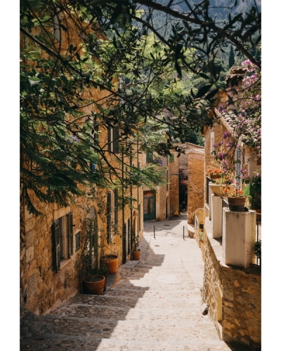
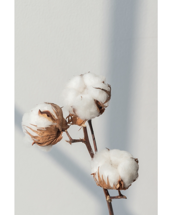
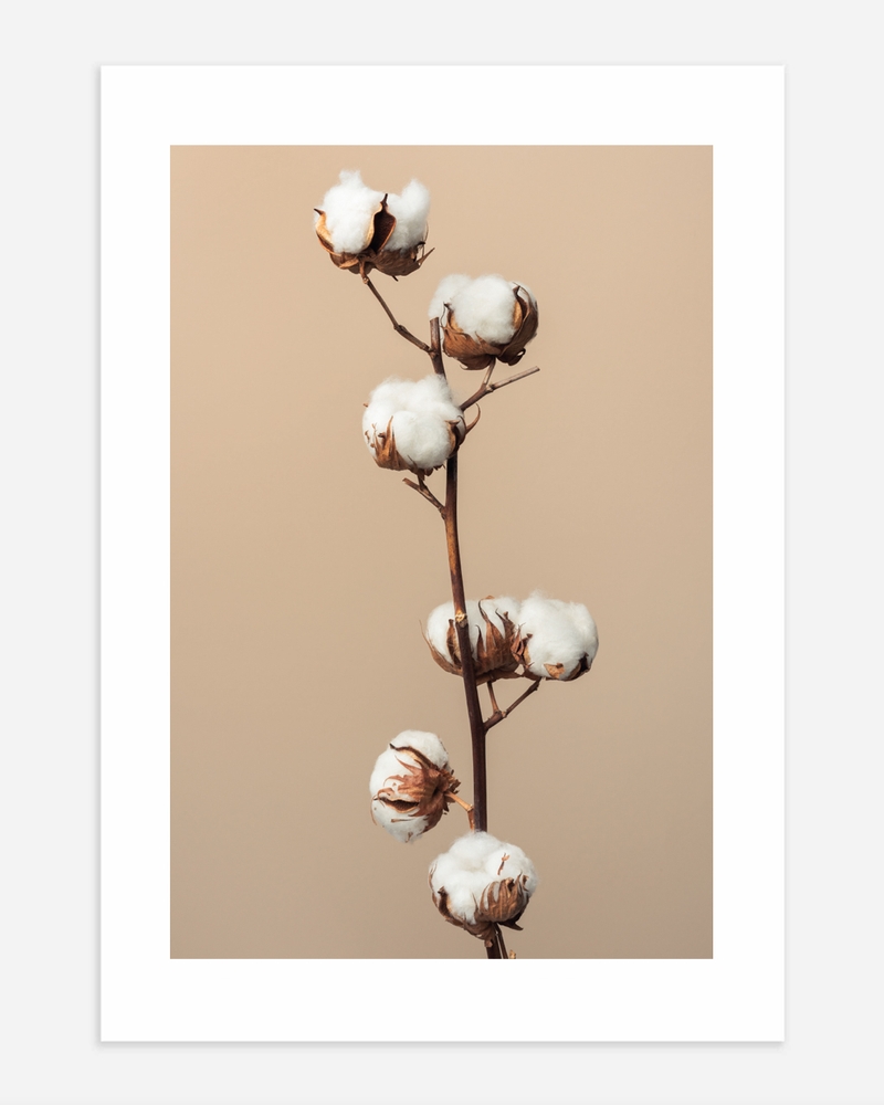
Vintage and muted-tone botanicals. Warm, earthy palettes with a slightly aged feel. These pair well with rustic, bohemian, or japandi interiors.


How to Frame Botanical Prints
Framing makes or breaks the look. A few guidelines:
Natural oak is the go-to for Scandinavian and organic interiors. It echoes the natural theme of the artwork and keeps things warm.
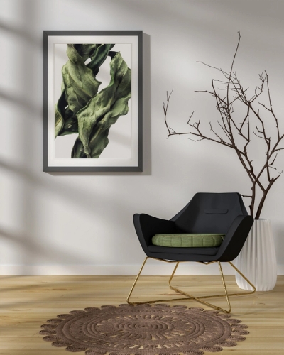
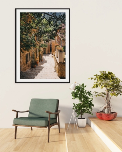
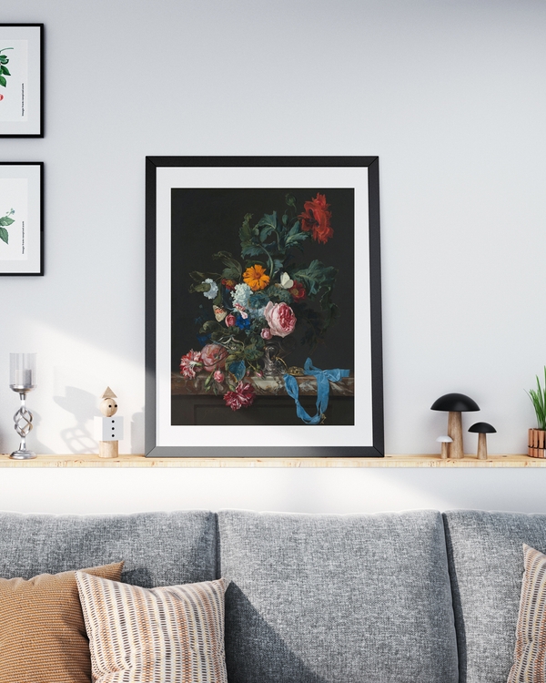
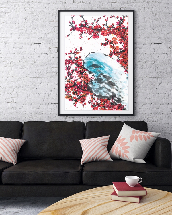
Black frames add definition and contrast. They're especially effective with lighter, more delicate prints that might otherwise disappear on a white wall.
White frames keep things bright and airy. They work well with photographic florals and modern minimal botanicals.
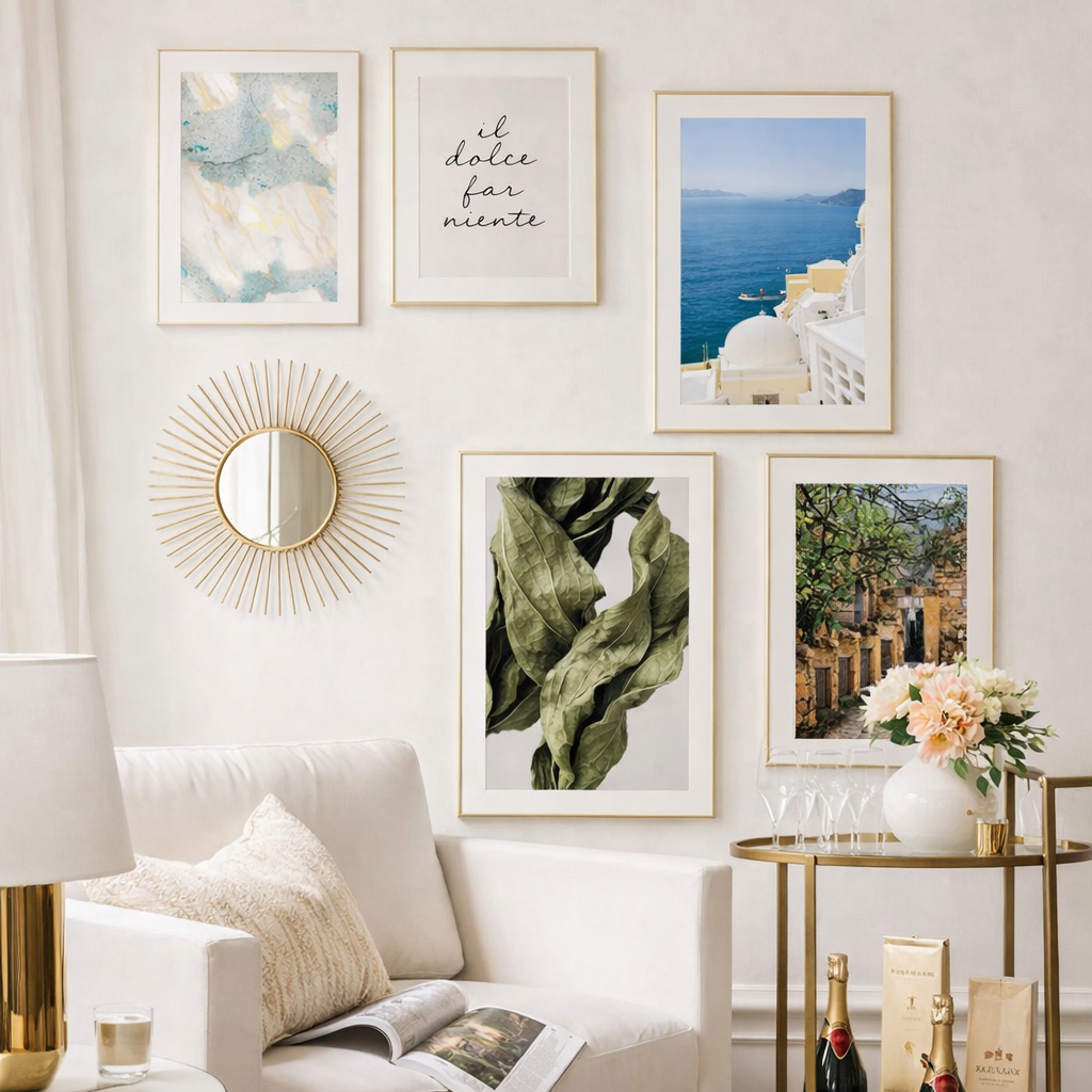
Gold or brass frames bring a touch of elegance. Surprisingly versatile — a thin gold frame on a vintage botanical print looks more curated than fussy.
One important detail: consider a mount (passepartout). A white border around the print adds sophistication and gives the artwork visual breathing room. It also makes smaller prints feel more substantial on the wall.
Placement: Where to Hang Botanical Wall Art
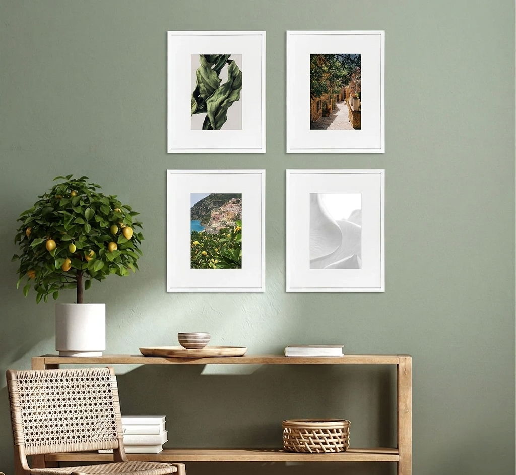
Above the sofa. A large botanical print (50×70 cm or larger) makes a natural focal point in the living room. If you prefer a set, try a pair of matching botanicals — symmetry works well here.
The kitchen. Herb prints, citrus illustrations, or simple greenery feel right at home near the dining area or above a counter. Smaller sizes (21×30 cm or 30×40 cm) fit narrow kitchen walls.
The bedroom. Go soft and calming. Muted florals or gentle leaf prints in pale tones help create a restful atmosphere without overstimulating the space.
The hallway. A vertical botanical print or a small set of three adds personality to an otherwise blank corridor. Hallways are often overlooked — a well-placed print makes the whole home feel more considered.
The bathroom. Yes, even here. A framed fern or eucalyptus print on a small wall brings a spa-like quality. Choose moisture-resistant frames if it's a wet area.
Building a Gallery Wall With Botanical Prints
Botanical prints make excellent gallery wall foundations. Here's how to combine them:
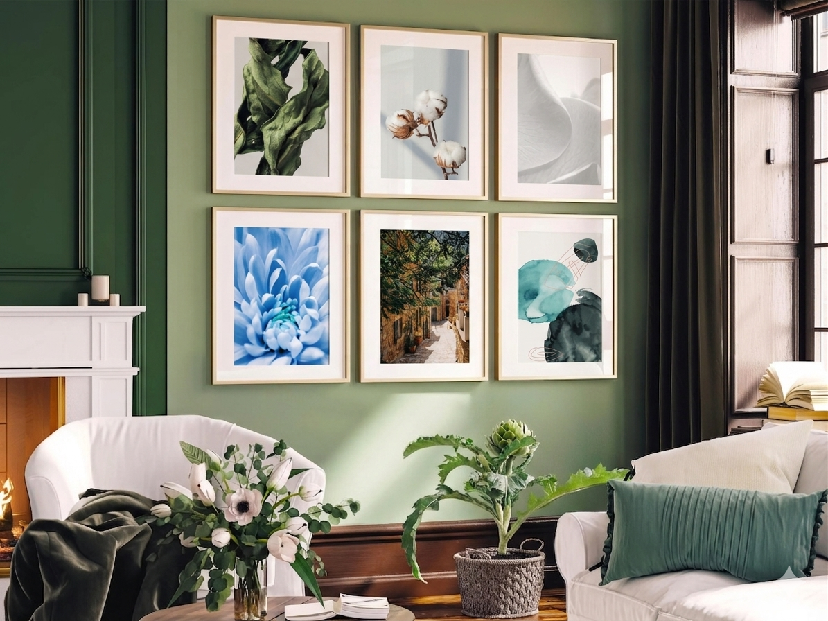
All botanicals. A wall of different plant and flower prints feels cohesive and natural. Vary the style slightly — mix an illustration with a photograph and a minimal line drawing — to keep things interesting. Stick to a shared colour palette so it reads as a collection, not a random assortment.
Mixed with other categories. Botanical prints pair well with abstract art (shared organic shapes), landscapes (shared natural theme), and typography (visual contrast). A gallery wall of two botanicals, one abstract, and one text poster is a reliable formula.
Consistent framing ties it together. When mixing print styles, matching frames create cohesion. All black or all natural oak keeps the eye focused on the artwork rather than the frames.
The sweet spot for a botanical gallery wall is usually 3–5 prints. Fewer can feel sparse; more can start to feel busy. Leave even spacing between frames (6–8 cm) for a clean, balanced look.
Seasonal Flexibility
One of the best things about botanical and floral posters is that they work year-round — but they're especially powerful in spring and summer when you want your home to mirror the season outside.
If you like rotating your art seasonally, keep your botanical prints as a spring and summer staple and swap in warmer, moodier pieces for autumn and winter. A botanical print that feels perfectly fresh in April still looks great in August — unlike seasonal decor that overstays its welcome.
Find Your Botanicals
Explore our botanical poster collection or browse gallery wall sets for ready-made combinations that include botanicals alongside complementary prints.
The right botanical print doesn't just decorate a wall — it makes a room feel alive.