How to Choose the Right Poster Frame
A frame isn't just something that holds your art — it's an essential design element that can make or break how your poster looks on the wall. The right frame enhances your artwork, complements your interior, and ties your whole room together. The wrong one? It can cheapen even the most beautiful print.
By Mansour
But with so many options out there - wood, metal, black, natural, thick, thin - how do you choose? Let's break it down so you can frame with confidence.
Start with Your Art
Before thinking about your room or decor style, look at the artwork itself. What does it need?
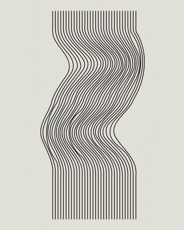
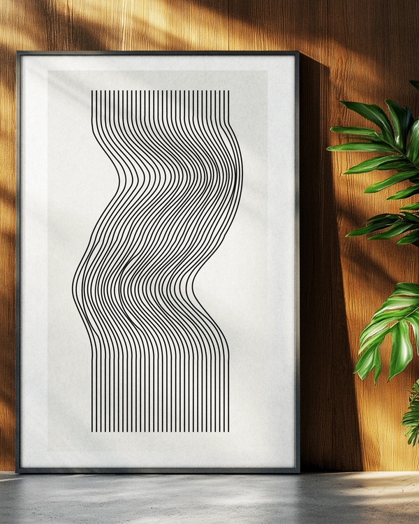
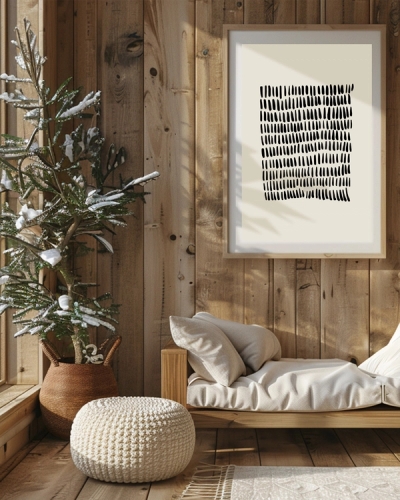
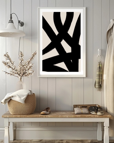
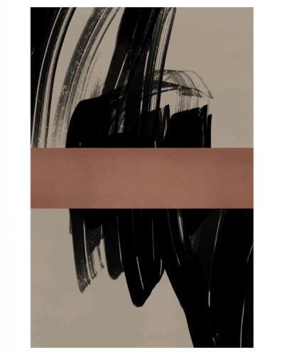
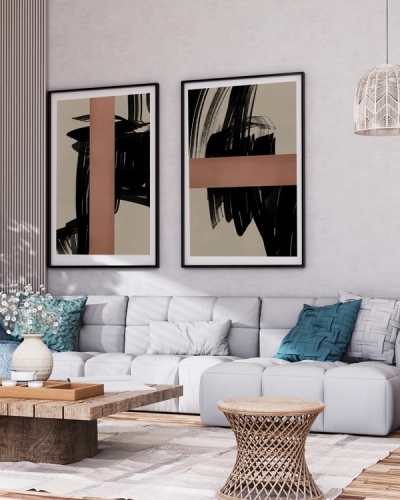
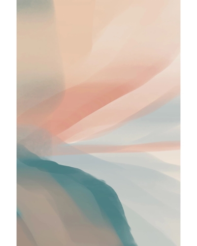
Bold, graphic prints often benefit from simple, understated frames that don't compete for attention. A thin black or white frame lets the art speak for itself.
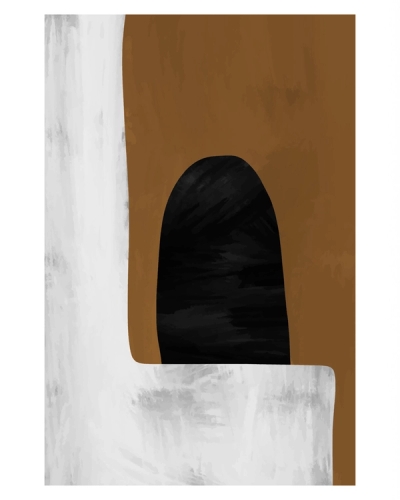
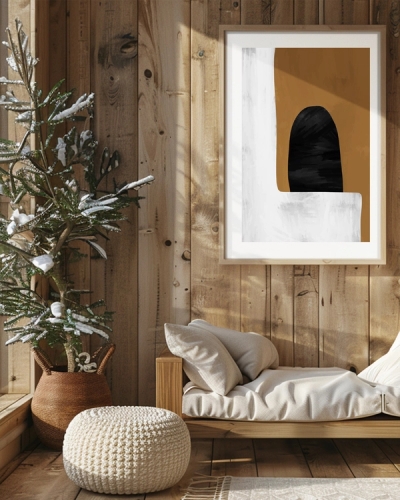
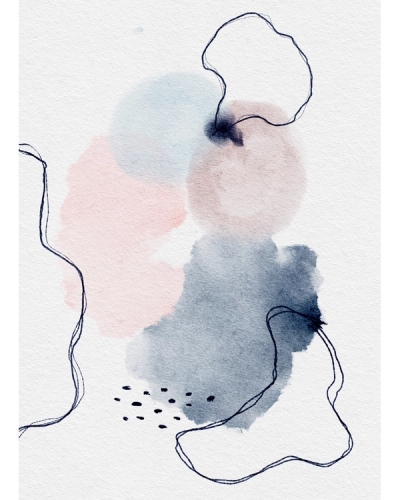
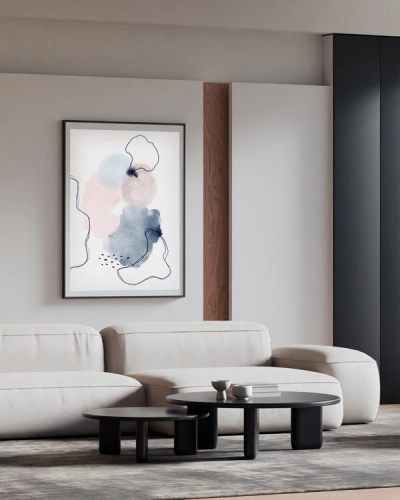
Delicate illustrations and line art can handle more substantial frames that give them presence and prevent them from getting lost on the wall.
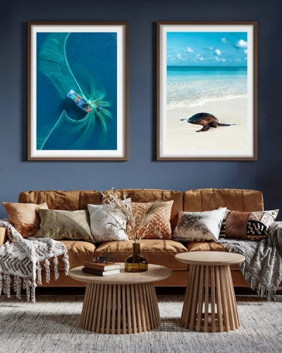
Photography generally looks stunning in classic black or natural wood frames, depending on the mood of the image.
Vintage and antique-style prints pair beautifully with ornate or distressed frames that echo their era.
The goal is harmony - your frame should feel like a natural extension of the artwork, not an afterthought.
Consider Your Interior Style
Once you've thought about what suits your art, consider where it's going. Your frame should feel at home in its environment.
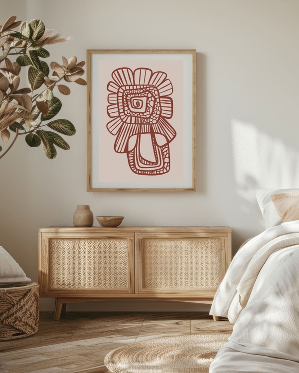
Scandinavian and minimalist spaces: Opt for light oak, natural wood, or slim black frames. Keep it simple and let clean lines do the talking.
Industrial and urban lofts: Thin metal frames in black, brass, or copper add edge without overwhelming. Raw wood works too.
Bohemian and eclectic rooms: Mix it up! This style thrives on variety — combine different frame colors, widths, and materials for that collected-over-time look.
Traditional and classic interiors: Rich wood tones like walnut or cherry, or elegant gold and silver frames complement traditional décor beautifully.
Coastal and relaxed spaces: Whitewashed wood, light natural frames, and simple white frames create that breezy, laid-back vibe.
Frame Colors That Always Work
When in doubt, these classic colors rarely disappoint:
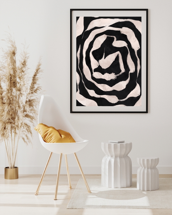
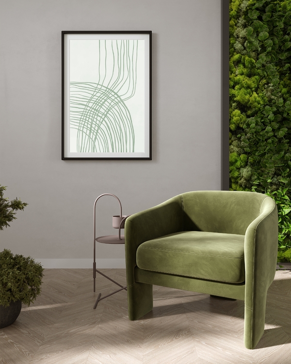
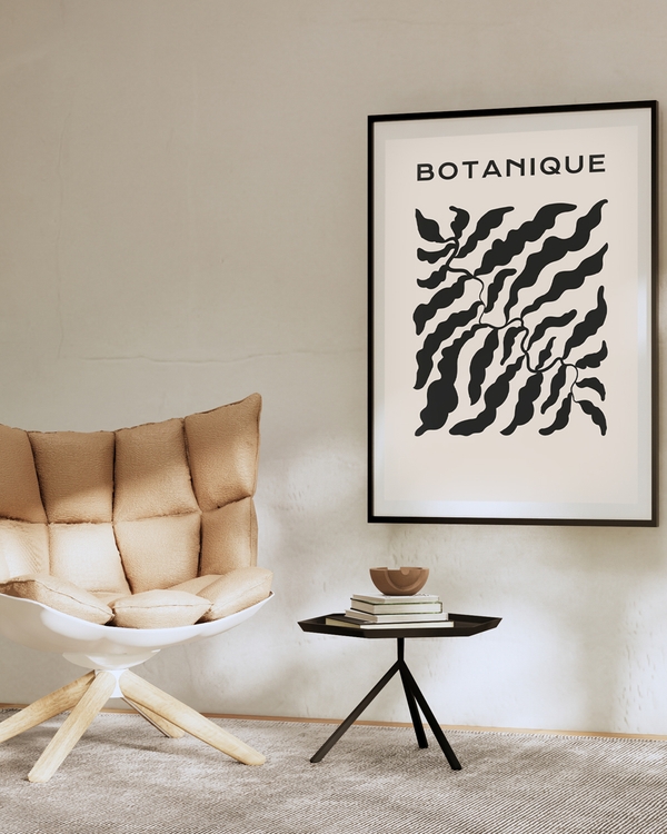
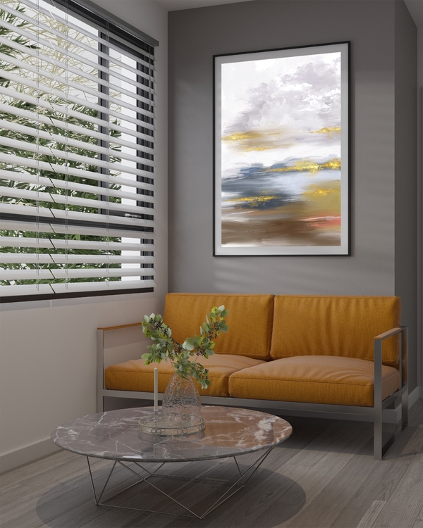
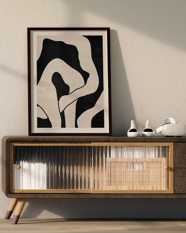
- Black: The universal choice. Black frames work in virtually any space and with almost any art style. They add definition without distraction and create a polished, gallery-like look.
- White: Fresh, clean, and perfect for lighter artwork or spaces that need a lift. White frames feel airy and modern.
- Natural wood: From light oak to rich walnut, wood frames add warmth and texture. They're particularly beautiful with nature photography, botanical prints, and Scandinavian-inspired spaces.
- Gold and brass: Trending right now and surprisingly versatile. Thin gold frames add a touch of elegance without feeling over-the-top. They work especially well with abstract art and fashion illustrations.
The safest approach? Match your frame to existing elements in the room - furniture legs, light fixtures, or other decorative accents.
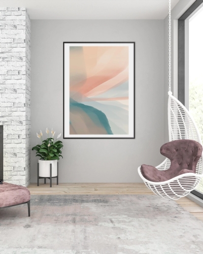
Frame Width: Thin vs. Thick
Frame width impacts how your art feels in a space more than you might think.
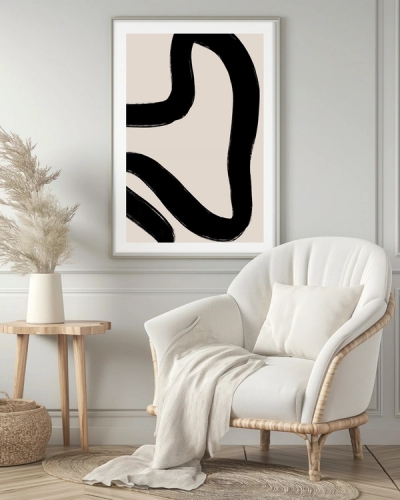
Thin frames (under 2 cm) feel modern, minimal, and let the art take center stage. They're perfect for gallery walls where you want cohesion without visual clutter, and they work well with graphic prints and photography.
Medium frames (2-4 cm) offer balance. They provide enough presence to stand alone while remaining versatile enough for groupings.
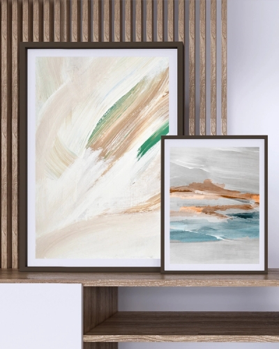
Thick frames (over 4 cm) make a statement. They add weight and importance to the artwork, making them ideal for standalone pieces that need to anchor a room. Be careful with gallery walls though — too many thick frames can feel heavy.
General rule: Larger art can handle thicker frames. Smaller prints often look better with thinner frames that don't overpower them.
To Mat or Not to Mat
A mat (or mount, or passepartout) is the border between your art and frame. It's not just decorative — it serves important functions.
Benefits of using a mat:
• Creates visual breathing room around your artwork
• Adds sophistication and a gallery-quality feel
• Protects art by preventing it from touching the glass
• Makes smaller prints feel more substantial
When to skip the mat:
• Modern, edge-to-edge framing for a clean contemporary look
• Posters and prints that extend to the edges by design
• When you want a more casual, relaxed aesthetic
White and off-white mats are classic choices that work with almost everything. For a more dramatic look, try a black mat with black and white photography.
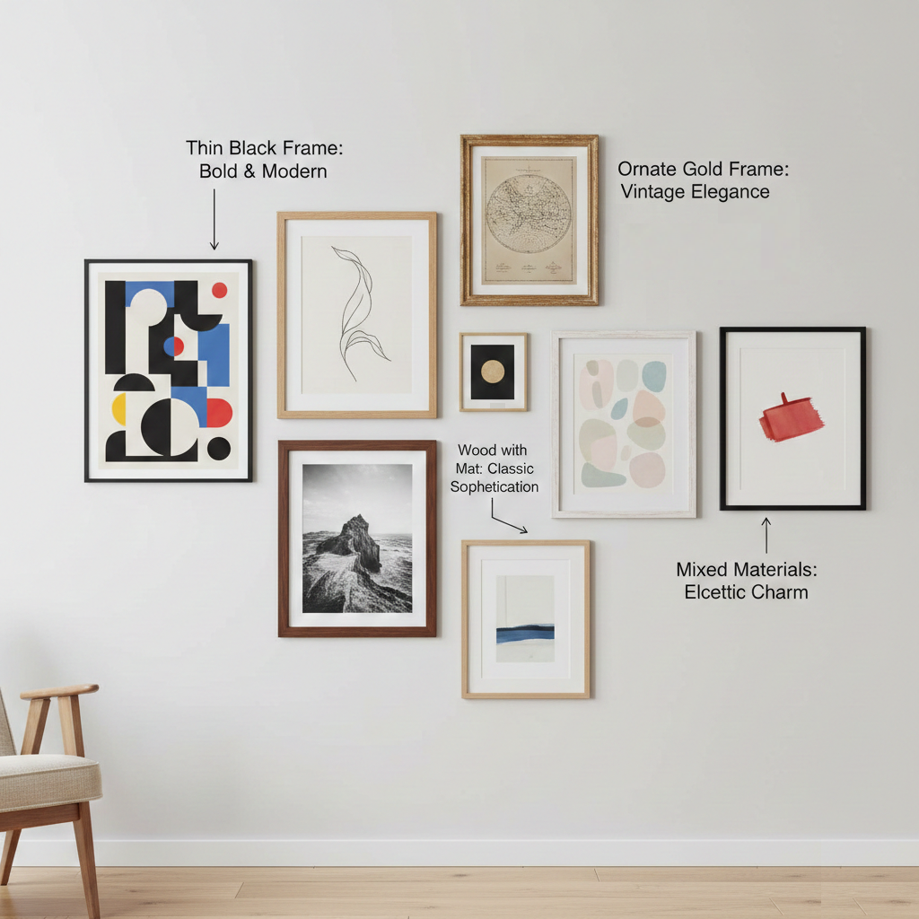
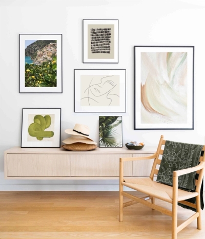
Matching Frames for Gallery Walls
Creating a gallery wall? Your frame strategy matters.
Uniform frames create cohesion. Using the same frame style throughout — whether black, white, or natural wood — ties the arrangement together and lets the artwork shine. This approach works especially well for photography series or themed collections.
Mixed frames add character. For a collected, eclectic look, combine different frame styles while maintaining a common element. Maybe they're all wood but different tones, or all the same color but different widths.
The middle ground: Stick to 2-3 frame styles that complement each other. For example, mix thin black frames with natural oak, or white frames with gold accents.
Final Thoughts
Choosing a frame doesn't need to be stressful. Trust your instincts - if something feels right when you pair it with your art, it probably is.
Remember that frames can always be changed. If you're unsure, start with versatile classics like black or natural wood. As your style evolves, your frames can too.
Related Posters

Related Stories
How to Create a Gallery Wall
There's something magical about a well-curated gallery wall. It transforms an empty space into a personal gallery, telling your story through carefully chosen art and photographs. Whether you're working with a spacious living room or a cozy hallway, creating a gallery wall is one of the most rewarding ways to make your home truly yours.
Posters for the living room — style tips & gallery ideas
Make your living room sing with posters: simple tips for size, placement and gallery walls that feel lived-in — not staged.